
✈️ What I’m Hoping to Learn at TC25
I’m heading to the Tableau Conference in San Diego with a mission that’s part data inquisitor, part historian: In addition to learning about how to build the best charts and dashboards for business, I also want to learn how to better use Tableau to bring historical data to life—especially to visualize events like WWII missions in ways that are meaningful, educational, and unforgettable.
I’m heading to the Tableau Conference in San Diego with a mission that’s part data inquisitor, part historian: In addition to learning about how to build the best charts and dashboards for business, I also want to learn how to better use Tableau to bring historical data to life—especially to visualize events like WWII missions in ways that are meaningful, educational, and unforgettable.
For quite some time, I’ve been exploring my WWII Veteran father’s 320th Bomb Group mission archive, an old-school HTML site filled with rich but unstructured historical data. My dream? I want to use Tableau to map missions, build timelines, and ultimately create an interactive experience that preserves the legacy of my dad and his fellow servicemen.
Here’s a look at a few of the sessions I plan to attend—and why they’re on my radar.
I🔍 Top Sessions to Help Me Visualize History with Tableau
1. Feast on Data: Digging into Advanced Viz Techniques
🕑 2:00 PM – 3:30 PM, Day 2
✅ Why I’m Going: This session dives into advanced table calculations—which might come in handy to visualize complex historical data (e.g., airstrike dates, locations, and outcomes).
2. Tableau Prep: Tips, Tricks, and Best Practices
🕛 12:00 PM – 1:00 PM, Day 2
✅ Why I’m Going: The WWII missions data isn’t exactly “clean.” It’s HTML tables and text—so this session will help me streamline that raw content into Tableau-ready formats using Prep.
3. Map It Like It's Hot
🕛 12:00 PM – 12:40 PM, Day 1
✅ Why I’m Going: Mapping is central to the story I want to tell—each mission has a location and a trajectory. This session should help refine my map design skills, especially around formatting and interactivity. Optimizing map performance for enhanced user experience and storytelling will be valuable to learn.
4. Beyond the Boundaries of Tableau
🕑 2:00 PM – 2:40 PM, Day 1
✅ Why I’m Going: I want to push Tableau to do more than just show data—I want it to tell stories. This session promises inspiration for going beyond the default charts. And LaDataViz, with Tristan Guillevin as the presenter, will be sure to dazzle!
5. Tableau Speed Tipping: 40 Tips in 40 Minutes
🕚 11:00 AM – 11:40 AM, Day 1
✅ Why I’m Going: A rapid-fire session full of golden nuggets that could unlock faster, more intuitive ways to build out visualizations.
🧠 The Big Goal: A WWII Storytelling Dashboard
By the end of the conference, I want to draft a roadmap for a project that looks something like this:
✅ Scrape and clean data from the 320th Bomb Group mission logs
🗺️ Map missions by date, location, and type using Tableau’s spatial features
📆 Build a timeline view of key mission events with tooltips and contextual annotations
🧵 Tie in narratives (quotes, excerpts) from the original website to humanize the data
🌍 Publish an interactive dashboard that’s accessible, educational, and honors history
🔜 What's Next?
After TC25, I’ll eventually blog again with lessons learned, favorite features, and maybe even a sneak peek at my WWII visualization project. In the meantime, if you’re passionate about history and data storytelling or you’ve done a similar project—let’s connect! I’d love to hear how you approach bringing the past to life with data.

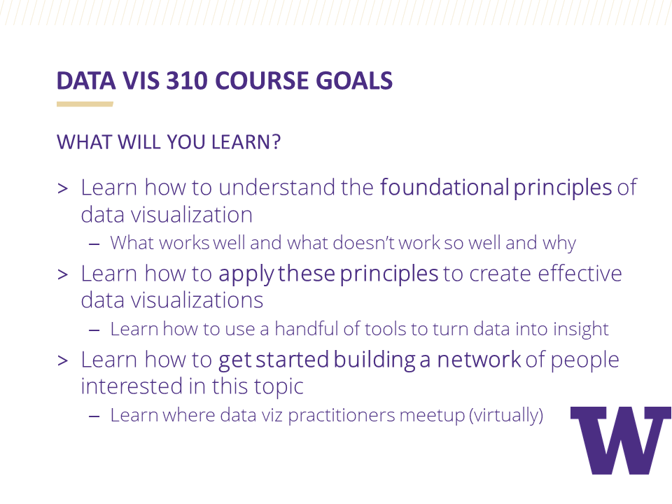
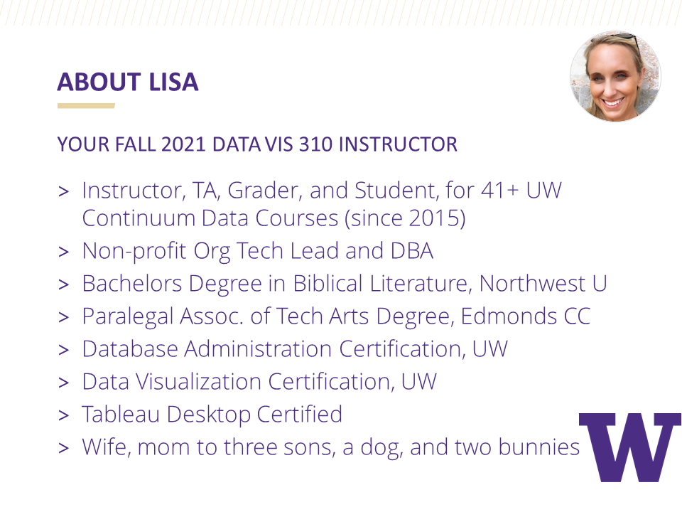
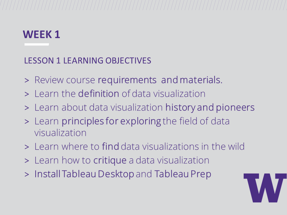
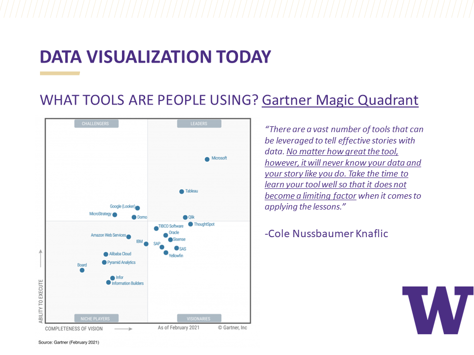
Ten Weeks of Learning Data Visualization
Transforming a spreadsheet of numbers into a data visualization can happen with a few simple steps if you use Tableau's drag and drop features. But unless you know a little about the theory, history, and cognitive psychology behind what makes a "good" data visualization, your design efforts might be in vain. So the question is: How much do you need to know before building a good data visualizations?
Transforming a spreadsheet of numbers into a data visualization can happen with a few simple steps if you use Tableau's drag and drop features. But unless you know a little about the theory, history, and cognitive psychology behind what makes a "good" data visualization, your design efforts might be in vain. So the question is: How much do you need to know before building a good data visualization?
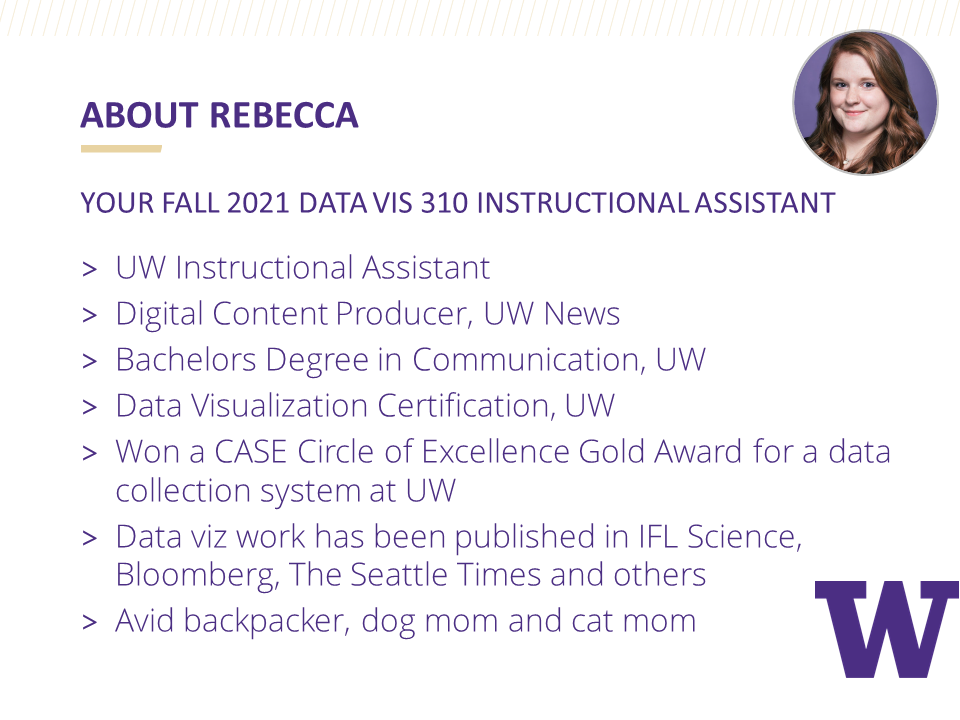
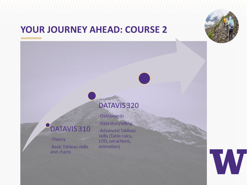
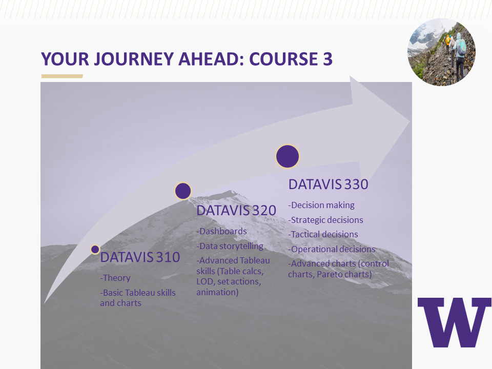
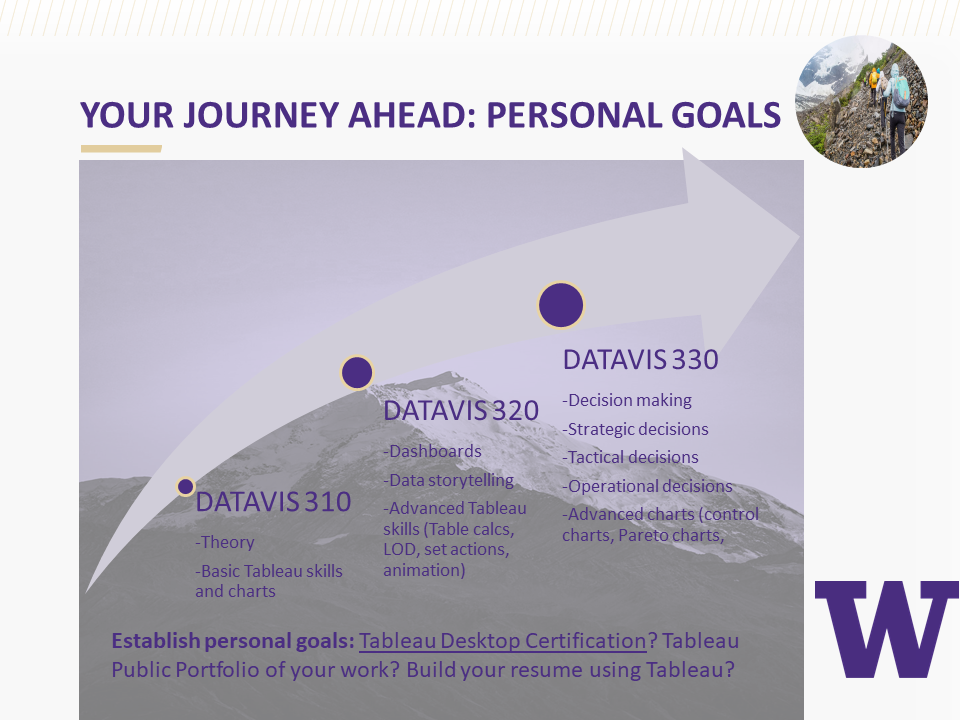
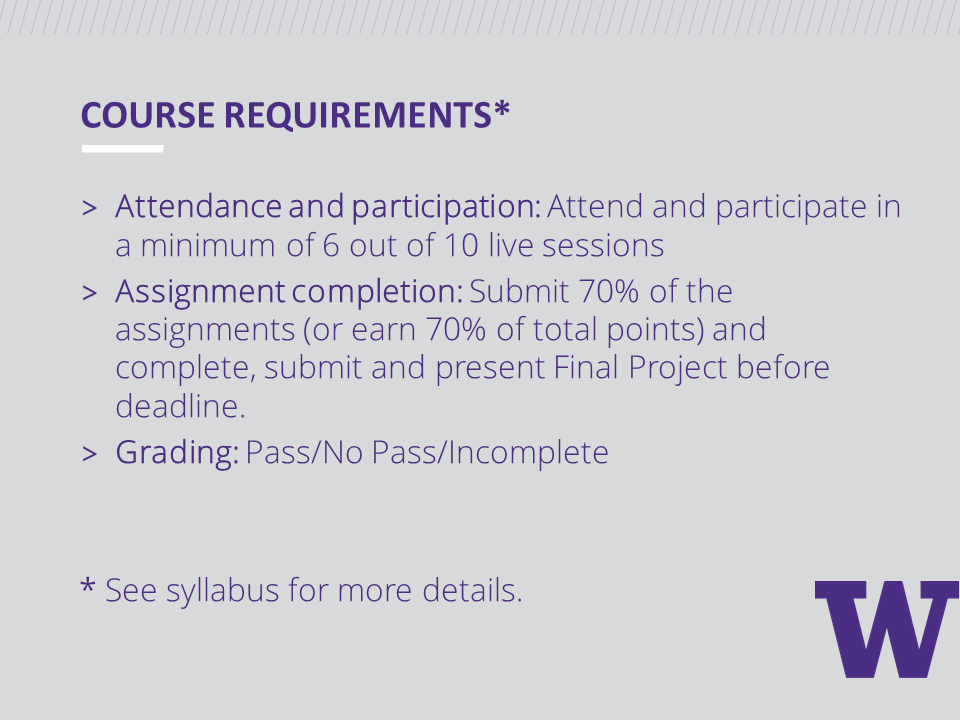
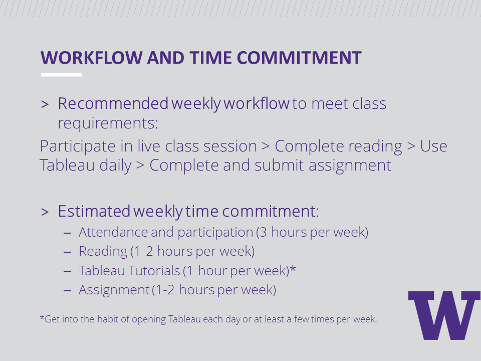
As members of the University of Washington Data Visualization Certificate Program instructional team, Rebecca Gourley and I recently had the privilege of guiding students through the first ten weeks of the data visualization learning journey. This first course in the certificate program walks students through data visualization history, theory, and best data visualization design practices. While students build a solid foundation for data visualization knowledge, they are also challenged weekly to develop technical skills by designing basic charts using Tableau.
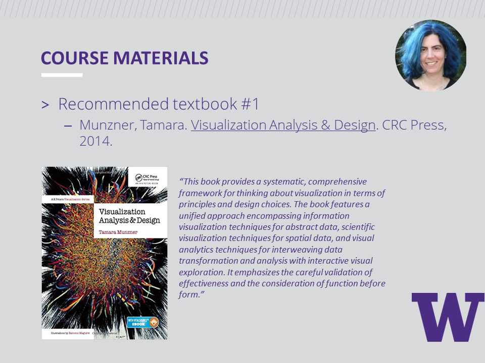
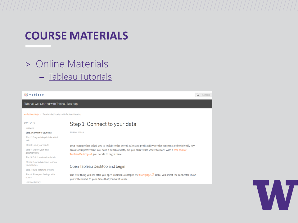
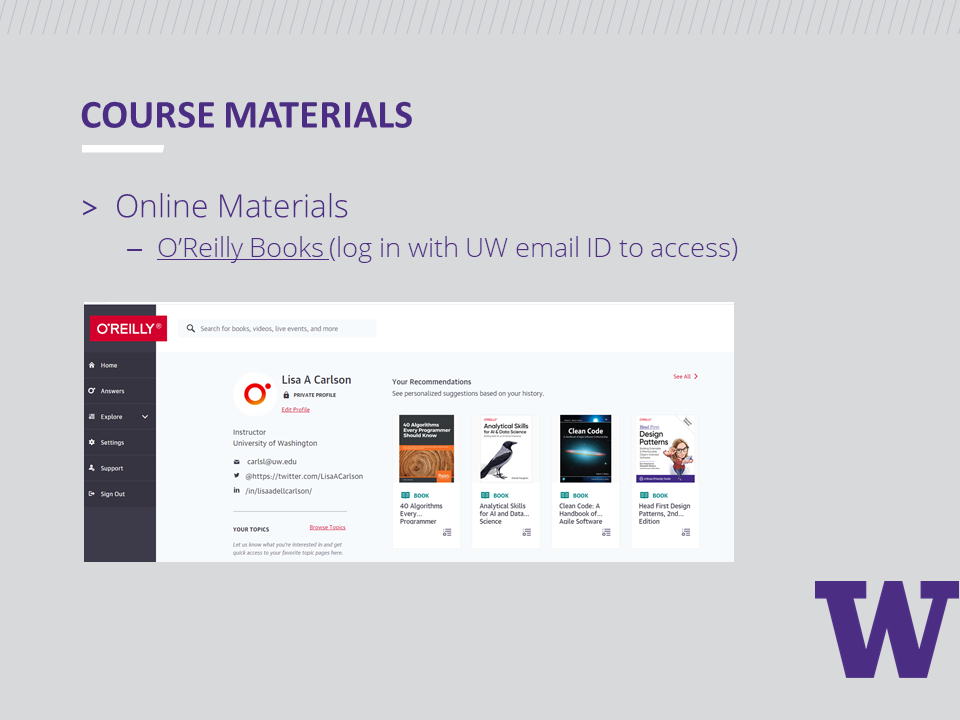
Before Week 1 began, we provided students with a free Student Tableau Desktop License and free access to Tableau tutorials. Students were also encouraged to read the recommended books listed below according to a reading schedule provided. Note: All O'Reilly e-books were free for the students with their UW student ID.
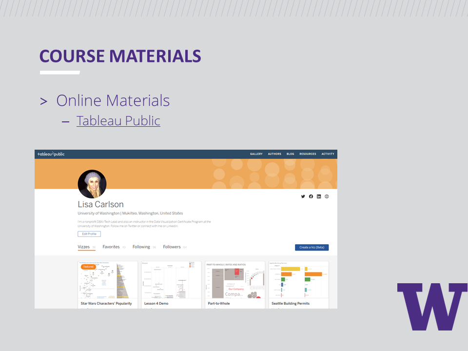
Our books
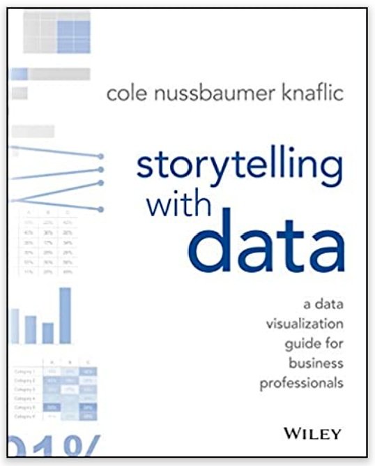
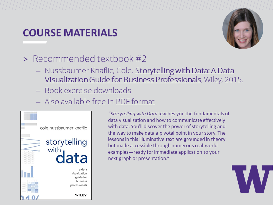
Storytelling with Data: A Data Visualization Guide for Business Professionals by Cole Nussbaumer Knaflic
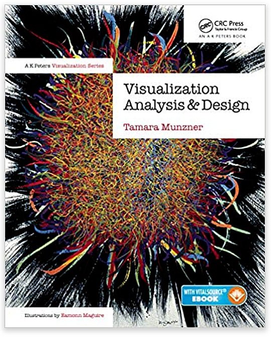
Visualization Analysis & Design by Tamara Munzner
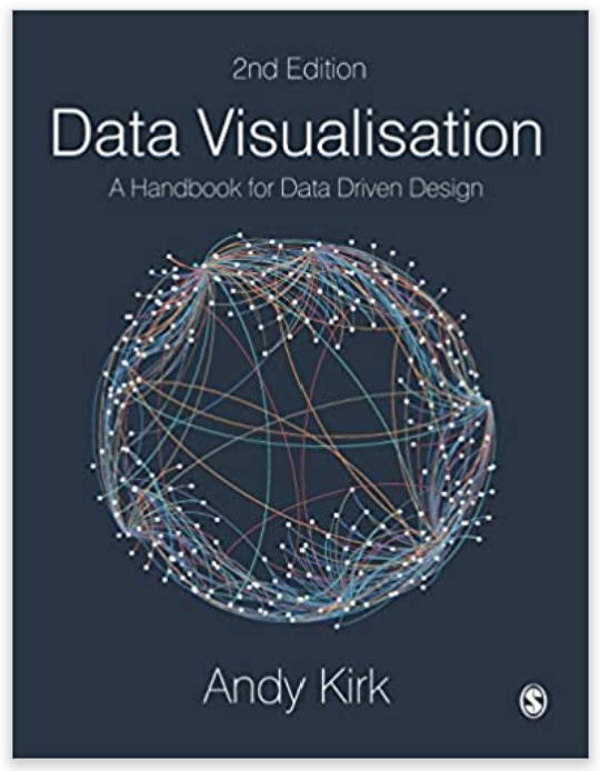
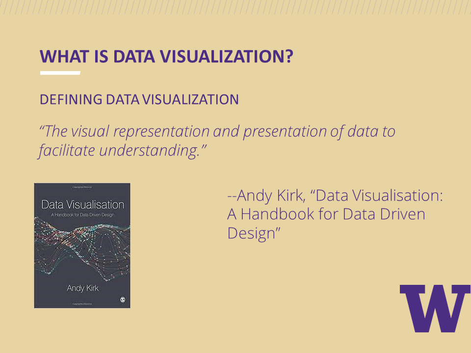
Data Visualisation: A Handbook for Data Driven Design by Andy Kirk
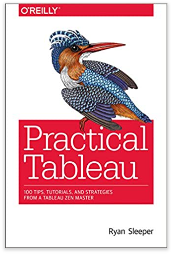
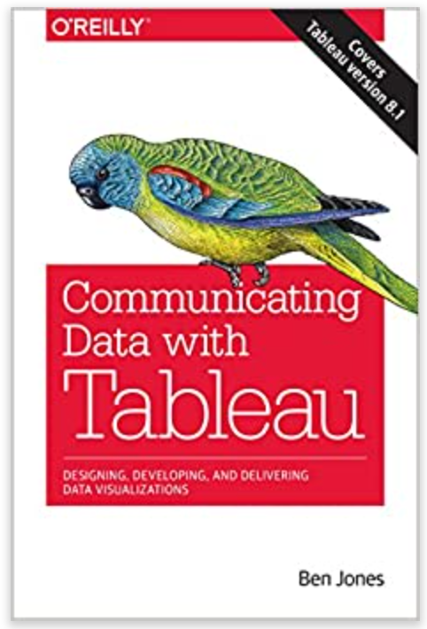
Practical Tableau by Ryan Sleeper
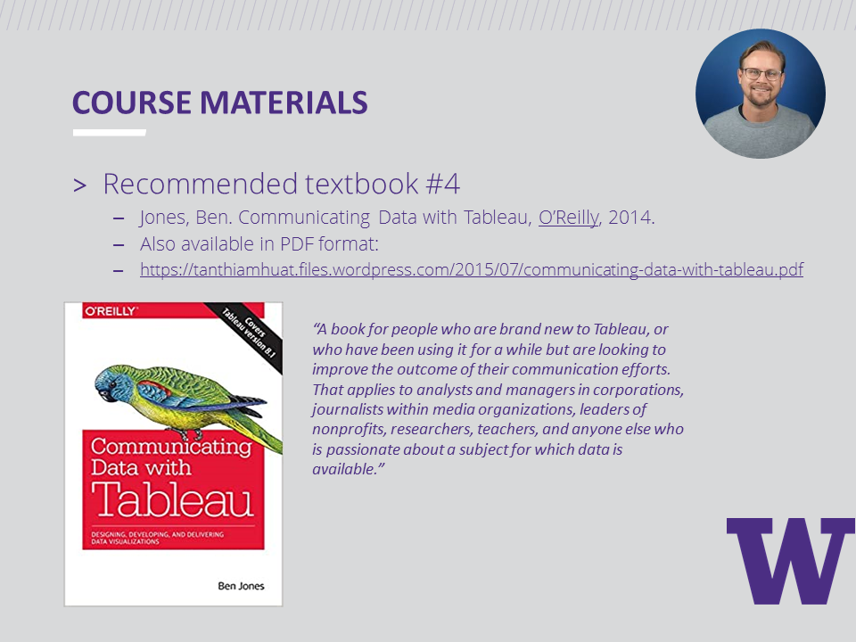
Communicating Data with Tableau by Ben Jones
Our weekly sessions
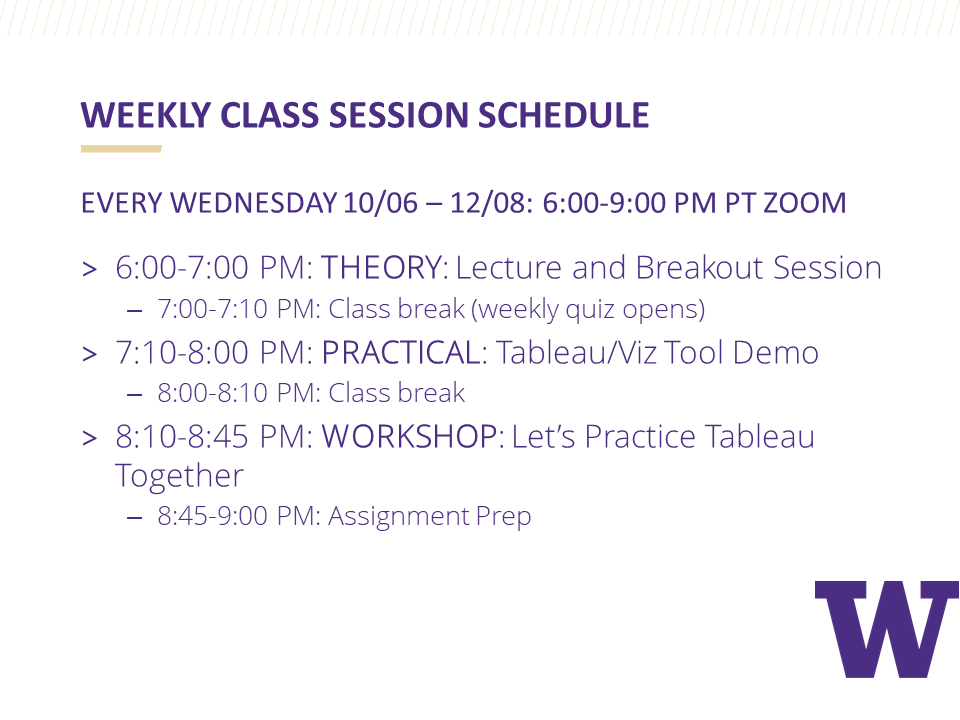
For ten consecutive weeks, our class of twenty-nine students logged in from various locations and time zones for three hours every Wednesday evening. During each session, we covered theory before diving into the practical application by building basic charts with Tableau.
During the week, students finished an assignment requiring them to build a new chart type each week. Rebecca Gourley helped students when they needed assistance with data wrangling or chart building challenges that required advanced Tableau skills.
The slide deck from our first session provides more details about the program and also shows how we typically break up a three-hour class session.

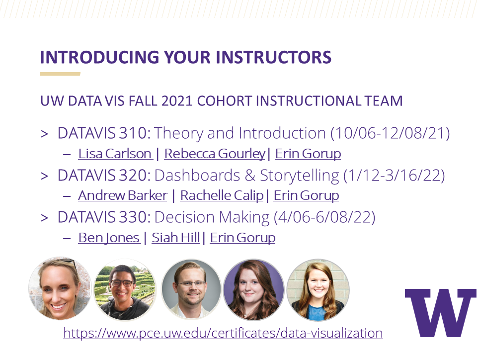


Our special guests
We added some spice to our sessions by having a couple of special guests join us. During Week 3, Carl Allchin, the author of Tableau Prep, introduced us to how Tableau Prep works using a helpful step-by-step demo where students followed along.

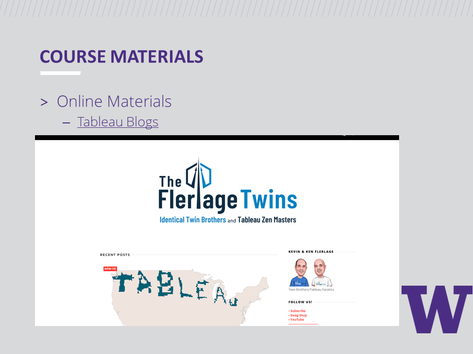
We then welcomed Kevin Flerlage as our guest during Week 9 where he shared Simple Steps for Better Design. After his presentation, Kevin spent time answering students' questions about his Tableau journey and the field of data visualization.

In preparation for student final project presentations, in Week 8’s session, we reviewed resources provided by Alex Velez of the Storytelling with Data Team. Alex has visited our classroom in person in the past and shared some great SWD resources with us so that students can learn how to practice delivering stellar data presentations.

Our Collection of Final Projects
Here are just ten final project examples where students visualized a data set of their choosing and then turned their visualization into a compelling data story. During our last class session, each student presented their data story in just 3 minutes using Cole Nussbaumer-Knaflic's Big Idea 3-minute story method found in Storytelling with Data. These final project submissions on their own seem to tell a story, but having students present their stories made them that much more memorable.
#1: Matt’s Project | California Wildfires
Matt took a deep dive into exploring the data behind California wildfires. He visualized the most destructive fires and used KPI's to highlight the more incredible data insights. You can check out Matt's interactive version of his dashboard here.

#2: Stephanie’s Project | The Big Brother House Guests
Stephanie is a big fan of the Big Brother House and spent weeks curating her data set to build a dashboard that allowed the user to filter for seasons and elimination weeks. Check out Stephanie's interactive dashboard on Tableau Public.

#3: Lynn’s Project | The History of Women in the Boston Marathon
Lynn’s dashboard powerfully communicates the history of The Boston Marathon and gender equality. She effectively uses annotations to point out key events in the timeline. Check out Lynn's interactive dashboard on Tableau Public.

#4: Rose’s Project | The Heritage Trees of Seattle
Rose’s exquisite dashboard explores the heritage of trees in Seattle. Her dashboard is a perfect textbook example of Ben Shneiderman's Information Seeking Mantra applied to dashboard design: Overview First (Title and lead-in paragraph, KPIs) > Zoom and Filter (map and treemap) > Details-on-Demand (table). Check out her interactive dashboard on Tableau Public.

#5: Josh’s Project | Why is My Catalytic Converter Missing?
Josh used the Tableau Story Points feature to take us on a captivating journey of what is happening with stolen car parts in Seattle. The image below is Josh's opening story point. Interested in learning the whole story? Check out the rest of Josh's story on Tableau Public.

#6: Ron’s Project | Cash is King in Japan
Ron effectively compared the currency of households in Japan to other countries with a beautifully designed dashboard. Check out his interactive dashboard on Tableau Public.

#7: Miranda’s Project | Dance with Prince
Miranda’s Prince dashboard design is absolutely stunning! Be sure to check out her interactive dashboard complete with media elements on Tableau Public.

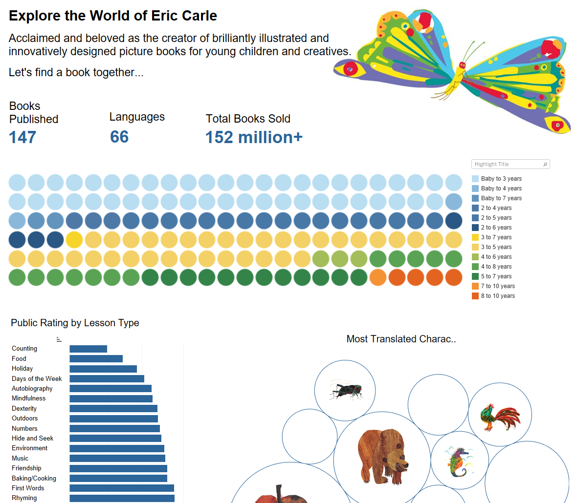
#8: Rachel’s Project | Exploring the World of Author Eric Carle
Rachel curated data from the works of Eric Carle and built a visually appealing dashboard to help her sister find just the right Eric Carle books for her niece to read. Check out Rachel's interactive dashboard on Tableau Public.
#9: Brandon’s Project | Bullish or Bearish
Brandon's dashboard tracks the history of the S&P 500. What makes his dashboard so exceptional is that he uses a zoom feature where the user can see the breakdown by month in a separate chart by selecting a point on the timeline. Check out Brandon's interactive dashboard on Tableau Public.

#10: Teagan’s Project | Shark Attacks in Australia
Teagan explored shark attack data in Australia and educated us on the history of shark attacks there since 1900. Did you know that helicopter shark patrols started in 2011 and seem to be working? Check out more interesting facts about shark attacks in Teagan’s interactive dashboard on Tableau Public.

This cohort of students is just ten weeks into the program and have yet to take two additional courses before finishing the certificate program in June 2022. Their data visualizations already look amazing. I can't wait to see what they do next.
For more information about the University of Washington Data Visualization Certificate Program, visit https://www.pce.uw.edu/certificates/data-visualization.

Data Visualization Fast Track Learning
Learning data visualization on the job works well if you have someone on your team who can mentor you and teach you the skills you need to know. But if you and your team leader have no formal data visualization training and you both decide that pie charts are what everyone wants to see
This information was first posted in Storytelling with Data’s Member Spotlight in May 2021. Check out the original post to read the feedback Lisa received from SWD Community members.
Learning data visualization on the job works well if you have someone on your team who can mentor you and teach you the skills you need to know. But if you and your team members have no formal data visualization training and you all decide that pie charts are what everyone wants to see (check out the meme below from The Office),

No Pam! This pie chart is scary! The bar chart wins.
The pie chart and bar chart images are examples from Death to Pie Charts.
For more data viz fun using humor from The Office, check out this BuzzFeed-style quiz.
then you could find yourself trapped in an unhealthy echo chamber. What's your escape plan? If you are the first person in your organization to research and develop this new area of knowledge, how do you go about it?
One option is to explore data visualization online tool tutorials and tool-based book tutorials. This option seems reasonable on the surface but doesn't usually cover the foundational history, theory, and current thinking on using data visualization properly.
A second option is to pursue a bachelor's degree or a master's degree focusing on data visualization. This option is costly and takes more time than many people are willing to invest.
And a third option, teaching yourself data visualization, is possible but requires a person to find a recommended roadmap and take the journey alone. This approach takes an incredible amount of self-discipline. Without an accountability partner and receiving regular feedback, it's easy to go off-track and blaze new unintended trails that can get a person lost.
Enrolling in a certificate program such as the University of Washington Data Visualization Certificate Program provides an excellent framework for learning data visualization history, theory, and best practices. You also develop technical skills to help you on the job. (These skills can also prepare you to pass a tool certification exam).
Here are other benefits to completing a certificate program in data visualization:
It holds students accountable: Students agree to attend live class sessions (usually online, with 60% live session attendance required to pass the course). Assignments and final projects include a due date, so students don't fall behind in their studies.
It's convenient: Online classes allow students to log into sessions from anywhere in the world.
It's engaging: Ideally, students will use a dual monitor set up to display the instructor's shared screen on one monitor and the data visualization tool open and ready to use on the student's second monitor. Students then follow the steps from the instructor's live demo to learn how to build a variety of charts and they get real-time help along the way if something goes wrong.
It's cost-effective: Certificate programs are affordable. Some programs offer a data visualization tool license (e.g., Tableau Desktop License at approximately $70/mo.) that helps offset the program's already low cost.
It's practical: The program highlights data visualization knowledge and practices while giving students the training they need to get good at using tools to build charts, dashboards, and data stories. Even though our program uses Tableau, the skills learned can be transferred using other tools such as Power BI and Excel.
It's flexible: The certificate program includes three courses to complete. In the rare occurrence that a student faces a crisis and needs to take a break from the program after the first or second course, they can pick up where they left off later in the year.
It helps students quickly build a network in the field: Instructors invite data visualization experts to live class sessions to introduce students to the various specialization areas. Specialty areas include data literacy, data cleaning and preparation, data visualization tools (e.g., Tableau Zen Masters), and data storytelling. Alex Velez of Storytelling with Data was one of our guests this past fall quarter. Her framework and methods for data storytelling helped students tell compelling data stories for their final projects in each course of the program. Students also learn about communities they can join beyond the certificate program.
It helps expose strengths and weaknesses: Many students come into the program with no knowledge of color theory or the value of decluttering their charts. Others may have good design skills but are weak at statistics or need to sharpen their presentation skills. Students are rarely good at everything. Completing weekly assignments building a variety of charts with different data sets exposes students' strengths and weaknesses. Students then get to regularly compare the quality of their work with students in their cohort. Together, they critique and offer valuable feedback to each other. Many students build self-confidence by learning to overcome their fear of public speaking using a framework for data storytelling—the SWD Big Idea 3-minute story.
So if you can commit 8-10 months to meet in a virtual classroom setting once a week in the evenings, and commit a few hours or more a week to completing assignments, then you are well on your way to earning a certificate in data visualization. The knowledge and skills you gain make this program a bargain. If you are interested in applying to the University of Washington Data Visualization Certificate Program, then visit this website for more detailed information.
My next post will provide you with a detailed account of what the first introductory quarter is like in a data visualization certificate program.

Data Visualization Meets The Office
Are you a fan of The Office, and do you also love the field of data visualization? If so, let’s have some fun: Which character from The Office best matches your personality type?
Are you a fan of The Office, and do you also love the field of data visualization? If so, let’s have some fun: Which character from The Office best matches your personality type? What if the employees at DunderMifflin were tasked with learning about data visualization and had to pick a list of data visualization books to read. Which books would they choose? Click on the image below to take this BuzzFeed-style quiz and find out:

Below are two examples of quiz results that you might get! Be sure to take the quiz to see who you are most like in The Office.

Example of a quiz result.
You are chatty, fast-talking, dramatic, and sometimes you gossip, but your ambition and assertiveness have helped you get ahead professionally. You want to read books that teach you how to become the best data storyteller in the business.
Here is the list of data visualization books you have chosen to read:
1. The Visual Display of Quantitative Information by Edward R. Tufte. This is the original classic book on statistical charts and graphs. This book will give you the foundation you need to understand the basic concepts of data visualization.
2. Storytelling with Data by Cole Nussbaumer-Knaflic. You can quickly learn how to communicate data clearly and concisely with this popular data storytelling book.
3. Storytelling with Data: Let's Practice by Cole Nussbaumer-Knaflic. This book is a great starter kit for you to plan a data storytelling workshop to impress everyone at corporate headquarters.
4. The Big Picture by Steve Wexler. You need to help corporate use data visualization to make better decisions faster. This book should get you there and fast before anyone else.
5. DataStory by Nancy Duarte. This book will help you prepare and present a compelling data story to corporate. It could be the key to getting your next big promotion.

Example of a quiz result.
You are intelligent but bored with your job and resent having to spend so much time at The Office. You are disgusted with your co-workers and their lack of productivity. You are looking forward to retirement and not having to spend each working day at The Office.
Here is the list of data visualization books you have chosen to read:
1. Visualization Analysis and Design by Tamara Munzner. This book appeals to your intellect. You are probably the only employee in The Office who can read it and actually understand it.
2. The Visual Display of Quantitative Information by Edward Tufte. This classic seems like a worthwhile read.
3. Information Visualization by Colin Ware. This book covers both the art and science of data visualization by a data visualization expert.
4. Storytelling with Data by Cole Nussbaumer-Knaflic. Since everyone else is reading this book, it's important that you stay informed, so add it to your list and be ready to explain its main message to your co-workers who won't understand it--because they rarely understand anything.
5. The Big Picture by Steve Wexler. Sometimes it's important that someone in the room understands the big picture. You are usually that person who brings clarity to the situation when no one else can. This book will help you perform well in your leadership role.

Practicing the 3-Minute Story and Big Idea
Students in the Data Visualization Certificate Program at the University of Washington, start their learning experience with a course that offers a practical introduction to data visualization theory. During these first 10-weeks, students learn about the science behind visual cognition and perception, the fundamentals of statistics, the history of data visualization, and along the way, students get the opportunity to learn how to choose an effective visual and build basic charts (e.g., bar charts, box plots, line charts, etc.) using primarily Tableau. The course final project challenges students to build effective charts and use them to tell compelling data stories.
Students in the Data Visualization Certificate Program at the University of Washington, start their learning experience with a course that offers a practical introduction to data visualization theory. During these first 10-weeks, students learn about the science behind visual cognition and perception, the fundamentals of statistics, the history of data visualization, and along the way, students get the opportunity to learn how to choose an effective visual and build basic charts (e.g., bar charts, box plots, line charts, etc.) using primarily Tableau. The course final project challenges students to build effective charts and use them to tell compelling data stories.
This past fall quarter, our student cohort met the challenge of building charts, and most had picked out their final project topic and knew which charts they wanted to use. Still, they needed some guidelines to make sure they articulated their message clearly and concisely. How could we have so many students communicate their message effectively using a minimal amount of time? Fortunately, the students had the perfect resource in their required reading, “Storytelling with Data” by Cole Nussbaumer Knaflic.
In Chapter 1 of Storytelling with Data, Cole spells out how to use The 3-Minute Story & Big Idea concept to tell your story effectively. Reading about the concept was helpful, but watching the experts present a message effectively in just 3-minutes, seemed like an even better idea. We contacted the SWD Team, and they agreed to help us out.
Alex Velez from the SWD Team met with me weeks before our ninth class session to prepare for a presentation to our class. Alex learned about the group of students and their interests and learning needs. Alex joined us for our ninth session and taught us about the strategies for delivering a stellar data presentation. Then she presented a 3-minute story for our students as an example.
After participating in Alex’s mini-workshop and following Alex’s 3-minute story presentation example, our students were ready to prepare and rehearse their 3-minute stories with poise and confidence.

An example from Cole Nussbaumer Knaflic’s book, “Storytelling with Data: Let’s Practice!”
The final project presentations were amazing compared to previous presentation class sessions when students did not receive training on how to master the 3-minute story presentation. Providing a framework (using the Big Idea) and spelling out constraints (3-minute limit) made our final project presentation night flawless time-wise. Each presentation effectively piqued the interest of the audience.
Check out some of the amazing visuals shared by students on final project night:
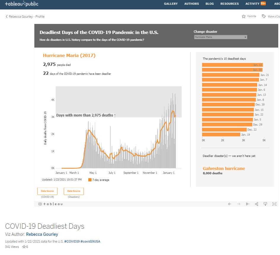
Rebecca’s COVID-19 Dashboard

Josh’s PPP Tracking Dashboard
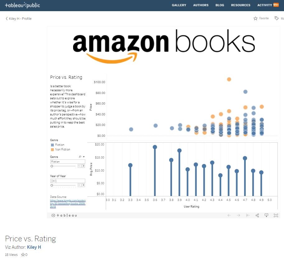
Kiley’s Amazon Book Dashboard

Savvy’s Volcano Eruptions Dashboard
In addition, check out Rebecca Gourley’s 3-minute story example.

The 3-Minute Story and Big Idea
When you think of a 3-minute story, what comes to mind? For me, it’s TikTok’s fairly new rollout of videos that are up to three minutes in length. If you’re not familiar with TikTok, I encourage you to check it out. You can find everything from recipe cooking videos (here’s a delish pasta recipe I made yesterday) to dog training videos, and even data visualization racing bar charts. The typical TikTok video length is 1-minute or less—that is until recently when they extended the video upload limit to 3-minutes.
When you think of a 3-minute story, what comes to mind? For me, it’s TikTok’s 2020 rollout of videos that are up to three minutes in length. If you’re unfamiliar with TikTok, I encourage you to check it out. You can find everything from recipe cooking videos (here’s a delish pasta recipe I made yesterday) to dog training videos, and even data visualization racing bar charts. The typical TikTok video lasts 1 minute or less—until they chose to extend the video upload limit to 3 minutes.

Racing bar chart showing GDP change over time.
Why did TikTok decide to extend their videos to 3-minutes? The theory is that 3 minutes allows for just a little more content—such as a full movie trailer—and this might reduce the temptation for the content creator to choose to post to YouTube instead of TikTok. Before 3 minutes, many content creators added Part 2 and Part 3 to their videos—without guaranteeing that the audience would decide to watch the sequel videos.
Whatever the reason, when I read about the new 3-minute TikTok videos, the first thing that came to my mind was Cole Nussbaumer Knaflic’s 3-minute story and Big Idea Strategy laid out in Storytelling with Data (and also in one of her blog posts). Cole teaches us the magic of boiling down your Big Idea (or story “so what”) into a single and concise statement, and then sharing that Big Idea in just 3 minutes takes a little more work but can become a rewarding experience.
Here are some of the benefits of using the 3-minute story approach:
You will see a more confident you. Memorizing and rehearsing a 3-minute presentation is easier than preparing a 20-minute presentation where you cover every detail on a topic (and, in the process, put your audience to sleep). A 3-minute story is a win-win for both the presenter and the audience. Most presenters can confidently speak for 3 minutes, and the audience's attention span should hold for that long (even though there is evidence that our attention span is now a mere 8 seconds).
Limiting your presentation to 3 minutes will make you look like you have mastered the topic. Being brief is the essence of intelligence. We have all heard the Hamlet quote, “Brevity is the soul of wit.” And the humorous story of the insult Wolfgang Amadeus Mozart allegedly received from Austrian Emperor Joseph II after he was bored by what he considered a long performance as portrayed in the movie Amadeus: “My dear fellow, there are in fact only so many notes the ear can hear in the course of an evening … don't take it too hard. Your work is ingenious. It's quality work. And there are simply too many notes, that's all. Cut a few, and it will be perfect.” Sometimes, our audience may think we are using “too many notes [words]” to get our Big Idea across, and like the Emperor, they want to hear less, not more.

“Too many notes.”
You will be less dependent on your slide deck and use fewer slides. Some of us love adding slides to our slide decks. One idea triggers another idea, and then we end up with a slide deck that will exceed our allotted amount of presentation time. We may have all the time in the world to tell our story (the SNL Old Prospector comes to mind), but most audiences appreciate it when we quickly articulate our story using just a few slides. And if we memorize our 3-minute story, we won’t become dependent on the slides to remind us of our next point to share (the infamous “Next slide, please,” said in a monotone voice).
You will be prepared for the unexpected. It’s not unusual for one or more presenters in a meeting to go over their allotted time. Sometimes, the audience may ask questions that prolong the presentation even if the presenter stays within the time limits. If your presentation is at the end of the meeting agenda, being ready to present your story in 3-minutes shows that you are prepared to present and a flexible and adaptable team member.
You may get more opportunities to share your story. If you can share your story effectively in just 3-minutes, audience members may be more inclined to invite you to share your story with other groups. “Hey, that was a great presentation. We would love you to present your idea in our upcoming staff meeting. We only have a few minutes left on the agenda, so your presentation will fit nicely into the schedule.”
Does the Storytelling with Data 3-minute Story and Big Idea Approach really work in practice? Read my next post, where I share what happened with an actual student cohort. Do you think the students met the 3-minute Big Idea challenge?
The featured image above is from Storytelling with Data.

Radial Bar Chart Challenge
This month’s Storytelling with Data Challenge to build a radial chart felt a lot like an Alice in Wonderland experience of falling down the rabbit hole.
This month’s Storytelling with Data Challenge to build a radial chart felt a lot like an Alice in Wonderland experience of falling down the rabbit hole.
“go down the rabbit hole. To enter into a situation or begin a process or journey that is particularly strange, problematic, difficult, complex, or chaotic, especially one that becomes increasingly so as it develops or unfolds.” (An allusion to Alice'sAdventures in Wonderland by Lewis Carroll.)
For this month’s #SWDChallenge, Cole not only challenged us but also visually inspired us with the use of radial chart images collected by Nadieh Bremer on Pinterest. As you can see, the possibilities are endless—so here we go further down the rabbit hole …

Image from Storytelling with Data Challenge Blog
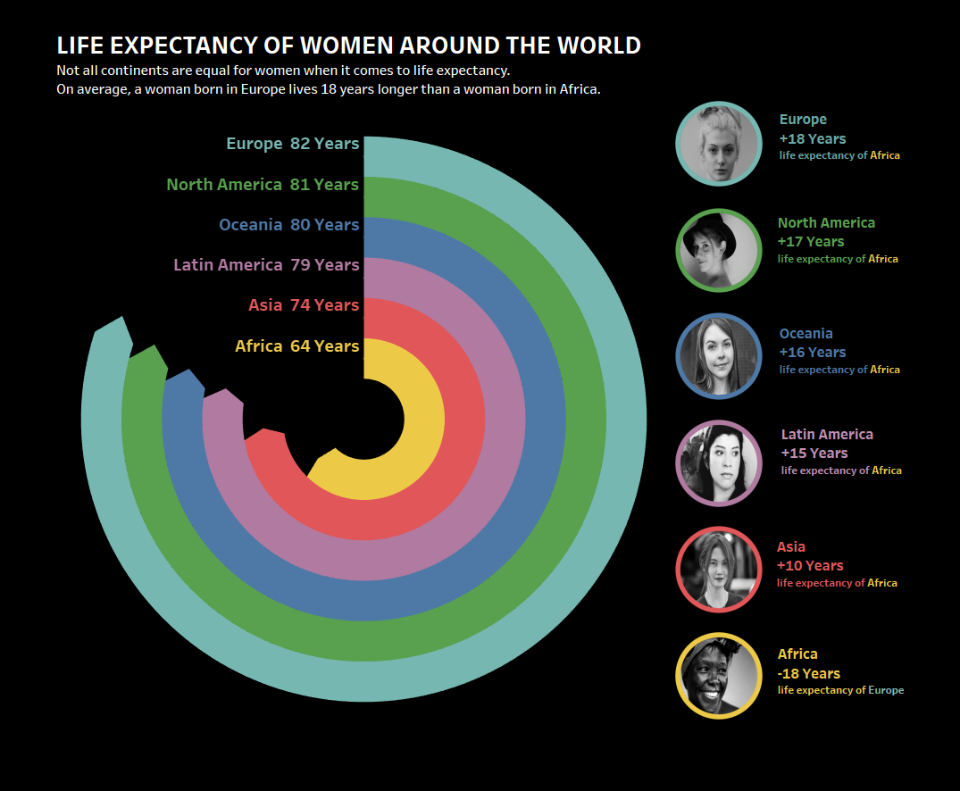
To find good instructions on the radial chart building process, I took to Google and found some great blog posts and video tutorials. As I was getting happily lost in the process, time was running out, so I kept the challenge simple by creating a radial bar chart with a clear message about the inequality of life expectancy of women around the world. I can now see how radial bar charts can work effectively to catch the eye and attention of an audience.
Check out the workbook here on Tableau Public. I added some table calculations that I plan to use to create a few more radial chart types in the future.
This monthly challenge has inspired me to think outside the box (the world of bar charts and line charts) and to experiment with using some of the more complex data visualization charts. To do so, I’ll have to continue to check my #SWDChallenge Twitter feed to find out more.
Here are the top Tableau radial chart tutorials I found:
How to videos:
SuperDataScience: Radial Pie Gauge Chart (what I used to create my simple radial bar chart): https://www.youtube.com/watch?v=w6qEG7AyDYo
Super DataScience: Tableau Radial Bar Chart Tutorial: https://www.youtube.com/watch?v=d6-aptKLvgg
Allen Kei: Radial Bar Chart Using Table Calculations: https://www.youtube.com/watch?v=wOYuXRqlKkM
How to blogs:
Ken Flerlage: Covering the basics: Beyond “Show Me” Part 2: Trigonometry
Marc Reid: Cool and more complex radials with animation: Tour de France and Radial Charts.
The Data School Jack Parry covering the basics: https://www.thedataschool.co.uk/jack-parry/create-a-radial-bar-chart-in-tableau/
Tableau Magic’s Toan Hoang step-by-step basics: https://tableaumagic.com/radial-bar-chart-tutorial/
Bora Boran’s tutorial with workbook: https://public.tableau.com/views/RadialCharts-Part2/Designadonut?%3Aembed=y&%3AshowVizHome=no#3
Oh what an exciting radial chart world it is! Have fun building radial charts, but since there’s so much to learn, here’s a word of advice found in Alice in Wonderland about how to approach your adventure:
““Begin at the beginning and go on till you come to the end: then stop.””

“Oh dear! Oh dear! I shall be too late.” -The White Rabbit from Alice in Wonderland
So when you begin, be sure to set a timer, because you’ll get lost in the whole process (adventure) if you don’t!
My Top Ten Questions About Dashboards
When did dashboards become so ubiquitous? Are they here to stay or are they just a fad? I needed answers to these questions before I felt good about investing precious time in learning how to design dashboards. However, one question led to another and then another. I bet you and others have these same questions. So here it is—my top ten questions and answers about dashboards. I’ll include images that I’ve collected along the way in my journey to learn more about dashboards.
When did dashboards become so ubiquitous? Are they here to stay or are they just a fad? I needed answers to these questions before I felt good about investing precious time in learning how to design dashboards. However, one question led to another and then another. I bet you and others have these same questions. So here it is—my top ten questions and answers about dashboards. I’ll include images that I’ve collected along the way in my journey to learn more about dashboards.
First of all, if you are like me, you like to see every step in the process—leave no stone unturned—when you are learning something new. That is the approach I take here while learning about dashboards. I find that if I skip over any of the most fundamental steps, I always feel lost at some point. I hope I included most of the fundamental questions. I don’t want to leave you in the dark if you are a beginner, so if you find that I have left out an obvious question, please let me know.

1. What is a dashboard? A dashboard (like the sample Tableau dashboard pictured below) is primarily a collection of charts that offers a quick status report of how the KPIs (Key Performance Indicators) are doing. If you want to dig deeper into the definition, you can learn more by checking out some of the resources listed at the end of this post.

A sample workbook dashboard found in Tableau Desktop.
2. Why are dashboards necessary? Aren’t simple charts good enough? Dashboards work more efficiently than a set of charts that are shown one at a time because “eyes beat memory.” When I first heard this phrase, I was unsure of its meaning. What it means is if you show someone a series of charts relating to the same subject and then ask them if they remember the information from the first chart, it’s likely they have forgotten that information. If you instead show them all of the charts in on one view, they don’t have to rely on their memory to recall what was on the first chart since their eyes can see all of the charts in one view.
3. Why are dashboards used in the business world? I found it incredibly interesting to learn that dashboards didn’t gain serious ground until the Enron scandal, which served as a wake-up call to corporations of the need to keep a closer eye on their performance. Since then, dashboards seem to be popping up everywhere.

4. What is the main characteristic of a useful dashboard? You know a dashboard is useful if it quickly communicates a clear message and a call to action to its intended audience. It’s that simple. Dashboards don’t have to be complicated. The main problem with most ineffective dashboards is that they become too complicated to the point of cognitive overload. People are easily overwhelmed and their attention span is short, so if it takes them more than a few seconds to understand a dashboard, you lose them.
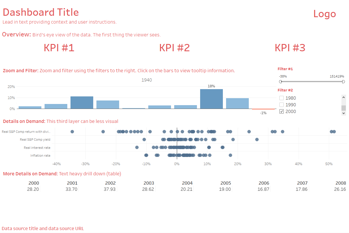
5. What is a good dashboard template to use? I learn best by following examples, so here’s a basic template I built using the principles found in Ben Shneiderman’s Information Seeking Mantra, a dashboard layout template example found in Ben Jones’ Communicating Data with Tableau, and then combining it all with one of the sample workbook dashboards included in Tableau Desktop.
6. Beyond using a template, what is the most effective design philosophy to use in dashboard building? You can quickly learn to think like a designer by using the clean design principles outlined in Storytelling with Data: A Data Visualization Guide for Business Professionals. by Cole Nussbaumer Knaflic. It’s an easy read and places you on the fast track to getting your dashboard built.
7. Should I include images in my dashboard? Adding the right images can make your dashboard memorable. If you are using a persona and a scenario to make the numbers more alive, then adding a face to your dashboard can help your audience make an emotional connection with the people (or animals) who represent the data points. Here’s an example of how using the face of a rhino grabs our attention and causes us to make an immediate connection with the dashboard. Interact with the dashboard here.
Dashboard designed by Eve Thomas featured on Tableau Public.
8. Who should build dashboards? Ideally, the people who use dashboards should build them. It’s true! People place more value on their own creations than those of others. This bias has been called “the Ikea effect”. It seems that even though we don’t cut down the trees and prepare the materials to build our Ikea furniture, just the act of assembling the furniture makes us value it more. This bias seems to hold true for dashboards.
Ask the stakeholders which metrics mean the most to them and then have them add those top priority numbers as KPIs and include interactive charts below the KPIs allowing them to explore the data. Most dashboard building software allows users to drag and drop objects into an empty dashboard template so everyone can build (or assemble) their own dashboards—just like assembling Ikea furniture! Then there’s this effect that happens—because we built it and know how much time we put into it—we value it more than if others built it for us. It’s a part of what’s known as self-service BI philosophy.
9. Are dashboards here to stay? This seems to be the case. You can study the report from Gartner and find out that that BI tools have now become mainstream purchases for businesses.

Gartner Magic Quadrant: A scatterplot showing the rankings of all of the major business intelligence software on the market as of January 2019.
10. What are some good resources for building dashboards? Some of the following links are Tableau specific resources but also include a lot of good information on general dashboard design principles. Happy dashboard building!
Books
Communicating Data with Tableau
Online Free Resources
Dashboard Design by Interworks
Dashboard Design Examples

Rebranding A Chart
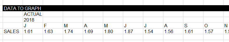
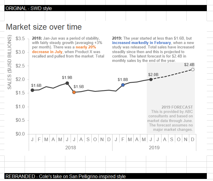
This month’s Storytelling with Data challenge #SWDChallenge from Cole Nussbaume Knaflic is to rebrand a chart. In her blog post, Cole showed us the steps she took to rebrand a chart with the San Pellegrino brand. It helped that Cole provided a data set as well as before and after images of the charts she created.
This month’s Storytelling with Data Challenge from Cole Nussbaumer Knaflic is to rebrand a chart. In her blog post, Cole shows us the steps she took to rebrand a chart with the San Pellegrino brand. It really helped that Cole provided a data set as well as before and after images of the charts she created.
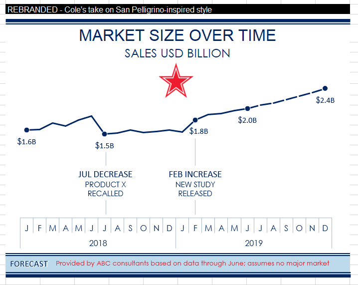
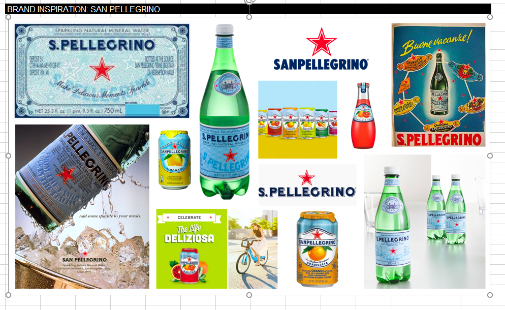
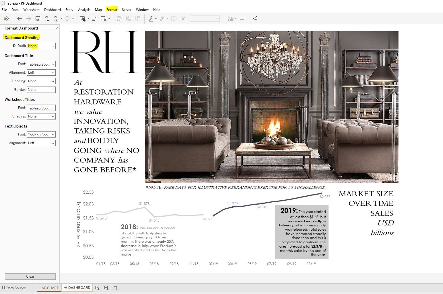
Step 1: Pick a brand
Although there were so many great brands to choose from, I ended up choosing the Restoration Hardware brand—my favorite home furnishings retailer! I absolutely love visiting the local store here in Seattle. I could not find an official Restoration Hardware style guide online, but I found a few links about the ideas behind the brand and information about fonts that can be used to match the font style. Here are a few images (hey—that’s my favorite sofa in one of the photos) that are typical of the Restoration Hardware brand and ads (Note: All images are the property of Restoration Hardware):


Step 2: Connect the data to Tableau
I used Tableau Desktop to connect to my data and build my chart and dashboard. Connecting to data is easy with Tableau. I downloaded the Excel document from Cole to my local drive and then connected the data.
Step 3: Create a line chart in Tableau
I added the Date dimension to Columns and the measure Sales (SUM) to Row. I added annotations that matched Cole’s example and changed the formatting to try to match the Restoration Hardware font (Century Gothic). I also played with the size of the font making the year bigger and bolder and adding bold text to the KPIs included.

Labels were all added to Sales to begin with. I then right clicked and chose to hide the data point labels that weren’t a part of the big story (and to match Cole’s example).
I also did little things such as changing the number format on the y-axis (right click Format > Pane tab > Default > Totals ? Numbers) to Currency (Custom) and add B to Suffix to abbreviate billions.

Instead of using the analytics feature in Tableau for forecasting, I used a darker shade for the 2019 annotation background (Right click on annotation and choose Format. Change Shading to 69%). You can pick any color you want for the annotation box background. On Shading, choose the down arrow and “More colors …”. There you can choose “Pick Screen Color” and select the color you are trying to match.

Step 4: Create a transparent dashboard in Tableau
Making a dashboard background transparent is so incredibly easy in Tableau. Simply create a dashboard and choose the tab at the top Format > Dashboard > Dashboard Shading > Default > None.
Step 5: Create a dashboard background image in PowerPoint
Now if you have your image and it is your only background choice (sized right, wash out is optimal, etc.) then in the Object section of your dashboard (left bottom corner) set your dashboard to Tiled and select Image.
In my case, I wanted to add a few text boxes in addition to the photo. I also knew that one of the fonts I wanted to use was readily available in PowerPoint but not in Tableau.
Here’s how my PowerPoint looked after I added an image and a few text boxes. I then saved the slide as a .png file on my local drive.
Note: If I want to change the background color of any of the text boxes I could match the grey in the picture by using the Eyedropper tool in PowerPoint.

Step 6: Add PowerPoint background image to Tableau dashboard
On Dashboard > Objects > Image (Make sure you are on Tiled) > Choose image from your local drive > Choose Fit Image (add a target URL if you want your audience to click on the image and go to another website. This probably isn’t what you want for a background image, though) > Choose Okay.

Step 7: Add chart to dashboard
Choose Floating and add the line chart to the dashboard. Resize until it looks right. (Keeping the gridlines option on helps to line things up. Gridlines can be turned on by choosing Dashboard tab > Show Grid. Just be sure to turn this option off before sharing your dashboard).
Note: If you have an object overlapping a chart or vice versa, you can change the Floating order of objects when you are in the dashboard. Just click on the object, choose the down arrow and select Floating Order and move object to front or back.
Step 8: Finishing up
There’s never an end to tweaking where dashboard design is concerned. Little things like text placement, text color, etc., are important in addition to the actual data that is being visualized.
The funny thing is—in the midst of my extensive googling—I found that Restoration Hardware had once carried a book about the history of typography. It looks interesting and I bet I could learn a lot from it.

So as a result of participating in this month’s Storytelling with Data Challenge, I now have a new appreciation for all the work done by graphic designers, typography experts, and those who develop brand guidelines for organizations.
Here it is: My finished project! Now time to take a break and plop down on my comfy RH sofa for a bit!


Visualizing Artisanal Data!
This month’s #SWDChallenge by guest author, Mike Cisneros, inspired me to put to use a data sample I tracked in Observe, Collect, Draw: A Visual Journal by Giorgia Lupi and Stefanie Posavec. If you haven’t yet picked up this book, I encourage you to do so! It’s a diary that inspires you to collect data on anything and everything, making you appreciate all of the details in your life. I also bought Dear Data by the same authors. Dear Data is a beautifully illustrated book of postcards Giorgia and Stefanie exchanged with each another for a full year. It’s hard to try to describe just how beautiful and unique these books are! My advice: Just be sure to buy Dear Data in the Flexibound format (instead of Kindle) for the best experience.
This month’s #SWDChallenge by guest author, Mike Cisneros, inspired me to put to use a data sample I tracked in Observe, Collect, Draw: A Visual Journal by Giorgia Lupi and Stefanie Posavec. If you haven’t yet picked up this book, I encourage you to do so! It’s a diary that inspires you to collect data on anything and everything, making you appreciate all of the details in your life. I also bought Dear Data by the same authors. Dear Data is a beautifully illustrated book of postcards Giorgia and Stefanie exchanged with each other for a full year. It’s hard to try to describe just how beautiful and unique these books are! My advice: Just be sure to buy Dear Data in the Flexibound format (instead of the ebook format) for the best experience.
Here is a page showing the data I collected on books that I own and could readily find in my house. I stopped collecting the data when I ran out of room on the page.

My collection of books!
My first attempt to visualize the data was a good example of practicing clean design but it lacked the interesting detail and personality of my handwritten data.

Clean design but lacking anything of interest.
Cole gave me some great advice on how to improve my chart:

So I went back and added annotations and images that helped tell more of a story about my data:

I have a hard time leaving well enough alone and I want to track more data on my reading in order to improve my reading comprehension, so who knows where this will lead!
Using Tableau's Viz in Tooltips
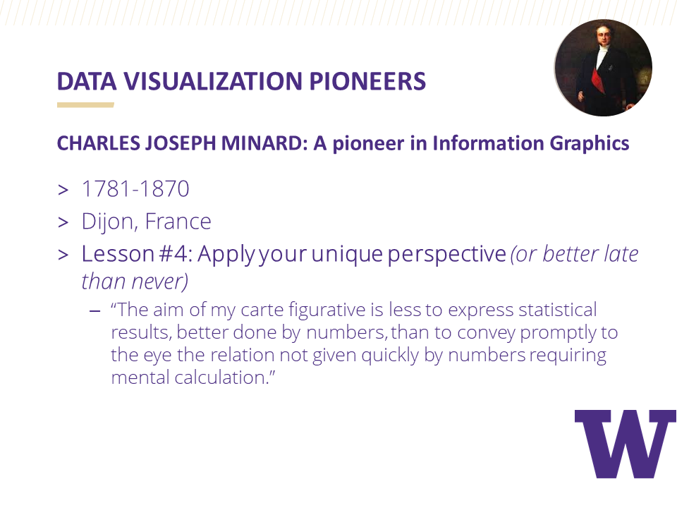
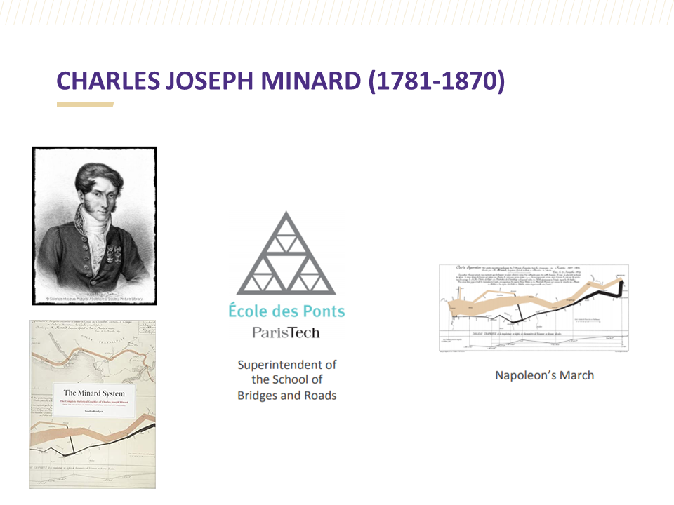
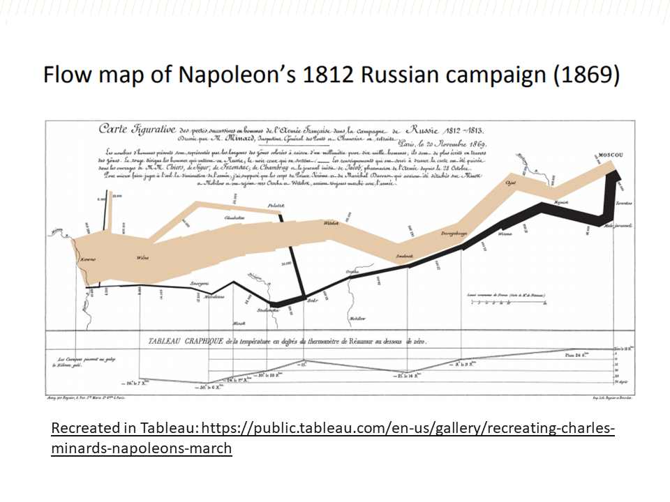
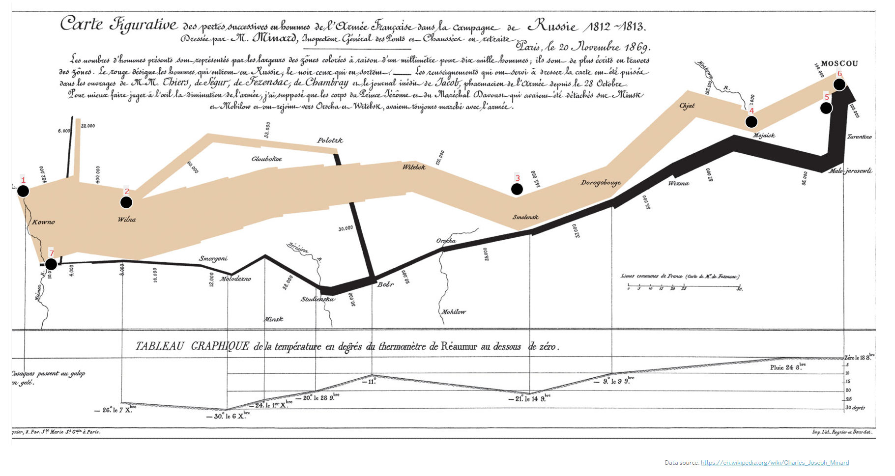
I’m a fan of Tableau’s Viz in Tooltips feature. I use it as a way to add context to charts, maps, and diagrams. For this month’s Storytelling with Data Challenge I really wanted to emulate my favorite chart but I wasn’t sure how I could do this in a way that would bring honor to its creator, Charles Minard. I finally decided on the idea to add Viz in Tooltips as a way to gain a deeper understanding of the chart. Check out my viz here on Tableau Public.
I’m a fan of Tableau’s Viz in Tooltips feature. I use it as a way to add context to charts, maps, and diagrams. I am also a big fan of Charles Minard and his work—in fact my only regret on my recent trip to Paris is that I didn’t make it to the Ecole Des Ponts Paristech library where his work is kept. So for this month’s Storytelling with Data Challenge, I decided to honor and emulate one of Minard’s most famous data visualizations.
I really wanted to emulate (match or surpass an achievement typically by imitation) my favorite chart but I wasn’t sure how I could do this in a way that would bring honor to its creator, Charles Minard. I finally decided on the idea to add Viz in Tooltips as a way to gain a deeper understanding behind the detail included in Minard’s chart. Check out and interact with my viz here on Tableau Public or directly below.

I searched Wikipedia and added information I found about the 7 central events in Napoleon’s Russian Campaign. This information appears in the tooltips that are activated on hover.
I used Tableau’s custom shapes feature to add Wikipedia’s pictures depicting each of the 7 events. I used a worksheet to filter these events and added the worksheet to the tooltips where they filter for each event.

I added a timeline to show the history of how the events fit together but I did not want the viz in tooltip to filter for each event which would essentially wipe out the line chart on hover. I found a great solution from Andy Kreibel on how to trick Tableau into not filtering for the worksheet by creating a dummy calculated field (a) to replace filter for all.

I credit Ryan Sleeper’s book, Practical Tableau, for providing clear instructions on how to add a background image as a map and then how to structure your data for mapping coordinates. Example: The Lookup row below is the pixel dimensions for the width and height of the photo I used.

The tricky part is getting the right size of image to import and making sure the pixel numbers match the mapping. Making sure the x field is for x is another important detail to get right.

Getting the coordinates right is surprisingly easy to do. Just find the place you want to place the data marker, right click, annotate, choose point, and the annotation screen pops up. Save it and the coordinates appear. Add these coordinate numbers to your x and y cells in your data source. Refresh your data source and remember to delete the annotations once you are done.

It’s that easy!
If I had more time I would try to emulate John Emery’s replication of this chart. I would also incorporate RJ Andrews’ recommendations on font choice when emulating Minard’s work:
Title block: REDONDA ITC light
Caps Lock caption: IM FELL French Canon italic
Regular Caption: IM FELL English italic
Cities: IM FELL Double Pica
Dates: Baskerville

Using a background image as a map and adding data markers to it can be used in so many different ways. It’s a surprisingly simple process, too. And then adding the Viz in Tooltips feature into the mix makes it even more interesting.
I will most likely do more research and dig deeper on more detail surrounding the actual dates and events during Napoleon’s Russian Campaign. I would like to add temperature to the Viz in Tooltips for a more complete account of each of the separate events. One fantastic book I just acquired that has inspired me to do so: The Minard System by Sandra Rendgen. The quality of images in the hard cover version is absolutely fantastic. Rendgen effectively shares insights into the historical accounts surrounding each of Minard’s charts with her captivating writing style. I am so glad that I purchased her book.


Visualizing Variance
This month’s Storytelling with Data February Challenge is to visualize the variance. Since Valentine’s Day is almost here, I chose to visualize a simple Valentine’s Day data set with a boxplot to show variance over time with age groups and whether or not they had changed their minds about celebrating Valentine’s Day.
This month’s Storytelling with Data February Challenge is to visualize the variance. Since Valentine’s Day is almost here, I chose to visualize* a simple Valentine’s Day data set with a boxplot to show variance over time with age groups and whether or not they had changed their minds about celebrating Valentine’s Day.
I first visualized each category as a small multiple line chart and then layered the corresponding boxplot over each chart. Using Tableau’s Analytics pane made it simple to add the boxplots. For added effect, I included a photo of a celebrity couple from each of the age groups above the charts to make the dashboard memorable. I also added the heart as a washed out background image in the charts to help give perspective on where the line and boxplot were plotted when comparing the charts.
Hovering over the boxplots reveals all of the quartile ranges. I added annotations to show the age groups with the most and least variance. Hovering over the line will show tooltips that provide specific information on percentages and years.
The Tableau Public workbook is published here and is also accessible below.
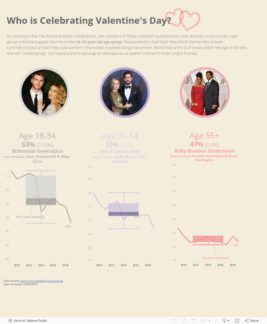
As you can see, the most variance occurs in the 18-34 age group (19%) with the least variance occurring in the 55+ age group (3%).
It was both timely and inspirational to have just watched Anna Foard’s session on Stats for Dataviz: Percentiles & How to interpret a box-and-whisker plot. I also highly recommend her blogpost on the topic.
*I plan to keep making improvements and adding features to this simple dashboard, beyond the #SWDChallenge. That’s what is so great about participating in the #SWDChallenge—it keeps you thinking about new ways to create.
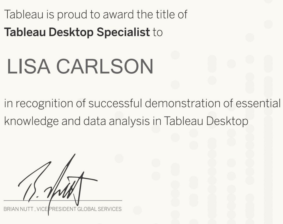
Preparing for the Tableau Desktop Specialist Certification Exam
You may be able to relate to my personal routine: Every day I check my Twitter feed and am blown away by the Tableau community’s ability to visualize data in the most unique and powerful ways. Many of the vizzes that go viral incorporate the latest in new features—from transparent worksheet backgrounds to the incredible power of dashboard set actions. These new features are not only exciting, but serve as a motivator for me to embrace those Tableau basics such Level of Detail Expressions and calculated fields. Mastering Tableau basics will hopefully help me build a solid foundation so that I can fully understand how to correctly use these new features. For instance, it is a little hard to understand set actions if you have never created a set.
You may be able to relate to my routine: Every day I check my Twitter feed and am blown away by the Tableau community’s ability to visualize data in the most unique and powerful ways. Many of the vizzes that go viral incorporate the latest in new features—from transparent worksheet backgrounds to the incredible power of dashboard set actions. These new features are not only exciting but serve as a motivator for me to embrace those Tableau basics such Level of Detail Expressions and calculated fields. Mastering Tableau basics like these helps me build a solid foundation so that I can fully understand how to use these new features correctly. For instance, it is a little hard to understand set actions if you have never created a set.
Taking the Tableau Desktop Specialist Certification Exam seemed like the most logical way to test my basic Tableau knowledge and skills.
Here are the top resources that I used when studying for the Tableau Desktop Specialist Certification Exam
General Online Resources
Tableau Exam Prep Guide There is no substitute for studying the skills measured in this comprehensive guide provided by Tableau. Keep referring back to this guide to help keep yourself on track in the study process.
Overview of Tableau Basic Concepts A helpful step-by-step hands-on exercise that guides you in building a data story that includes using LOD Expression and calculated fields.
Tutorialspoint Tableau Tutorial A website that provides a topical index with tutorials covering many of the basic concepts you need to know.
Blogs
The Tableau Desktop Qualified Associate Exam Although this post is advice for the next level of certification, Tableau Ambassador, Sarah Bartlett, offers a lot in the way of practical steps on how to register to take the exam and what to expect. This advice is especially valuable if you have not ever taken a proctored online exam.
LearningTableau.com Testimonial Lukas Halim’s testimonial includes exciting insight on how he felt the knowledge questions were just as challenging as those he found in the QA exam.
“I Got Tableau Certified” Another testimonial for the next level up (QA), but incredibly helpful in the amount of detail it provides.
Video Tutorials
Tableau Free Training Videos The mother lode of Tableau training videos. Nothing can replace watching these videos if you want to get a good understanding of each of the key concepts.
Tableau Desktop Specialist Training by Manideep Yakkala A Tableau Conference session video recording that effectively explains each exam concept and demonstrates how they work in Tableau.
Tableau Live Training Recordings Live training sign-ups with accessibility to past recording sessions. This training is complete and provides beginning and completed workbooks that you can download and use to create your own visualizations. Nothing beats this type of practical experience to build skills.
Books
Practical Tableau: 100 Tips, Tutorials, and Strategies from a Tableau Zen Master A complete and logically organized book written by Tableau Zen Master Ryan Sleeper with individual chapters dedicated to the full explanation and practical use of of basic and advanced features. The step-by-step how-to guides found in almost every chapter are easy to follow.
Tableau 9.0 The Official Guide A well-written book that serves as a good beginner’s manual. If you are new to Tableau or a little rusty on the basic understanding of its features, start here.
Communicating Data with Tableau A great overall hands-on introduction to Tableau by legendary Tableau expert and University of Washington Data Visualization Certification Instructor, Ben Jones, using examples that are easy to relate to and understand. Download the companion data sources and workbooks and follow the step-by-step instructions to build all of the most commonly used charts. Dashboards and story points are covered, too.
Practice Tests
Tableau Exam Guide Sample Questions Answer these Sample Questions and then check the accuracy of your answers provided in the Solutions section below the questions. Keep taking this practice test until you get all of the answers correct and understand the concepts.
LearningTableau.com A series of quizzes written by Lukas Halim providing realistic and challenging questions. I also bought a practice test that was helpful and ratcheted up the challenge level a notch or two.
Tableau Magic quizzes A newer resource of a growing collection of quizzes centered around testing Tableau knowledge.
Next steps
My new goal is to study for the Tableau Qualified Associate Exam. I will keep referring back the study resources I used for the desktop specialist exam and plan to supplement these resources with one or more of the following:
Tableau for Beginners: Get QA Certified, Grow Your Career Udemy Course by Lukas Halim which looks like a good overview of basic and advanced skills that are important to know.
Learning Data Visualization with Tableau 9 by Matt Francis, which several Tableau experts have recommended taking as a way to go back to the basics and fill in those learning gaps.
Tips for Preparing for the Tableau QA Exam presented by the Information Lab’s students who took the exam. If you are not familiar with these dynamos, Andy Kreibel, Eva Murray and the Information Lab, know that they lead the way in teaching Tableau to the world through their Makeover Monday Project movement. Their book, #MakeoverMonday: Improving How We Visualize and Analyze Data, One Chart at a Time is an excellent resource for anyone interested in developing good habits in analyzing and visualizing data. These people are Tableau heroes.
Some random advice …
I see the value of learning Tableau keyboard shortcuts to breeze through some of the more mundane aspects of creating a visualization. This will help you save precious time during the exam.
If you work in a dual monitor environment, practice using just one screen or a split screen and get comfortable bouncing back and forth between Tableau workbooks and your browser to experience more of what it is like in the test environment.
If you don’t feel ready for the test, reschedule until you feel better prepared but commit to a personal deadline so that you can move on to your next Tableau challenge.
In conclusion …
After passing the Tableau Desktop Specialist Certification exam, I can confidently say that the test was a fair representation of the “skills measured” described in the study guide provided by Tableau, so be sure to keep referring back to the guide. I also see how easy it is to get some of the knowledge questions wrong—especially those multiple choice questions where you are asked to “check all answers that apply.” Questions can get tricky, even if you feel you are studied up. This didn’t bother me personally because for me the experience was more about learning Tableau at a deeper level than earning the certification.
What I do know is that studying for certification can help build confidence by strengthening knowledge and basic skills, but there is no substitute for spending time using the tool regularly. So ultimately, the goal of certification is to get in the habit of using Tableau for your work and/or passion projects so that you can whip up an impactful viz at a moment’s notice!
Good luck to everyone planning to take the exam!

War on Christmas Day
The theme for this month’s Storytelling with Data Challenge is holiday data. While I originally planned to choose a data set with a more festive theme, I happen to read an article about the original meaning of the classic song, “I’ll Be Home for Christmas”. The song is sung by a soldier during World War II who dreams of coming home for Christmas.
The theme for this month’s Storytelling with Data Challenge is holiday data. While I originally planned to choose a data set with a more festive theme, I happen to read an article about the original meaning of the classic song, “I’ll Be Home for Christmas”. The song is sung by a soldier during World War II who dreams of coming home for Christmas.
After hearing this story, I started researching data about Christmas and war time. I stumbled upon an article with information about 5 Momentous Military Events that Took Place On Christmas Day and built a dashboard using Tableau Desktop to tell the story of these events.
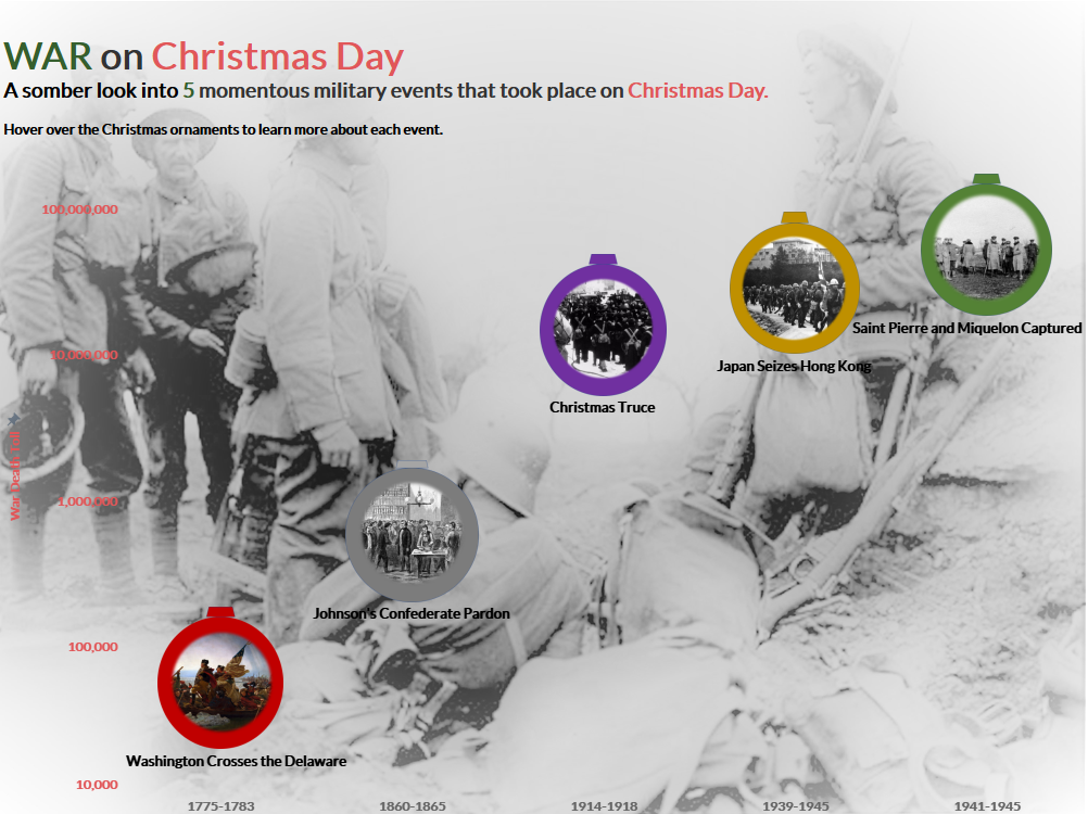
The most clear way to visualize the data is to use a timeline and I decided the most important measure to convey is the magnitude of lives lost during these wars.
The hardest part of building the visualization was deciding how to use the images in the dashboard as data markers that communicated the theme of Christmas. I decided to turn the images into Christmas ornaments and was fortunate enough to have watched Kevin Flerlage’s Video on Using PowerPoint with Tableau Dashboards.
To summarize my experience in building this visualization: I am so thankful for those who have gone before us and have made the ultimate sacrifice. Because of their sacrifice, we can experience peace this Christmas season. Merry Christmas and Peace on Earth!
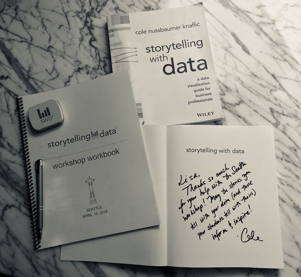
Storytelling with Data
I was first introduced to Cole Nussbaumer Knaflic’s book, Storytelling with Data when I was a student in the University of Washington Data Visualization Certificate Program, where I currently serve in the role of a grader. Cole’s book had an instant appeal in offering such a practical approach to data visualization in contrast to the stuffy approach taken by other books on the topic. Storytelling with Data along with Alberto Cairo’s The Truthful Art: Data, Charts, and Maps for Communication and Edward Tufte’s, The Visual Display of Quantitative Information are my top three must-read books for anyone interested in learning the basics of data visualization.
The book
I was first introduced to Cole Nussbaumer Knaflic’s book, Storytelling with Data while I was a student in the University of Washington Data Visualization Certificate Program, where I currently serve in the role of grader. Cole’s book had an instant appeal in that it offered a practical approach to data visualization in contrast to the more academic based approach taken by other books on the topic. Incidentally, Storytelling with Data along with Alberto Cairo’s The Truthful Art: Data, Charts, and Maps for Communication and Edward Tufte’s, The Visual Display of Quantitative Information are my top three must-read books for anyone interested in learning the basics of data visualization.
In her book, Cole clearly guides the reader on how to visualize data the right way and demonstrates just how surprisingly easy it can be to build effective charts for a business setting. Too often we build charts that are so complex that only a select few can understand them. Instead, Cole shows how choosing the right visual, stripping away clutter, and using good design principles, can help focus the attention on the important data in order to get the main point across to an audience.
The workshop
I had the privilege of attending and helping with set up at Cole’s all-day in person workshop in Seattle this past spring. Cole divided the workshop into several lessons--giving emphasis to each major learning concept. The use of repetition and compelling real life scenarios for each concept helped encode important points to memory. The "big idea" of trying to help people do things in smarter ways came through clearly. The key principle of using data as a pivotal point in an overarching story was demonstrated effectively time and time again.
Major takeaways
1. Know your audience before creating content for your data story. Know their background, biases, and the data available.
2. The big idea in your data story should articulate your point of view, convey what's at stake, and should be in the form of a complete sentence.
3. Be able to communicate your big idea in 3 minutes or less and envision what a successful outcome will look like.
4. Storyboard your communication up front to keep yourself on track and reduce iterations. Cole used the narrative arc method and helped us arrange components of our story using sticky notes.
Simply put, I highly recommend Cole’s workshop. Cole’s rare talent in presenting her material in such a polished way creates a captivating and unforgettable experience for her audience. The principles learned easily resonate and stick with you beyond the workshop. Applying these learned principles will bring incredible value back to your organization.
The podcast
Cole offers a thought provoking podcast that provides yet another way to encode the clean design concepts and practices into your brain. She interviews fellows experts in the field and offers up some good entertainment with her pie chart bashing and insightful book reviews. You can access her podcast through your phone music app or via this webpage.
The challenge
Each month, Cole announces a Storytelling with Data Challenge (Twitter hashtag #SWDchallenge) to her followers, giving them one week to create (or improve) a chart using straightforward design principles that clearly communicate the message. Each month she chooses a new theme. The theme for October is creating a scatterplot. Here is my submission:
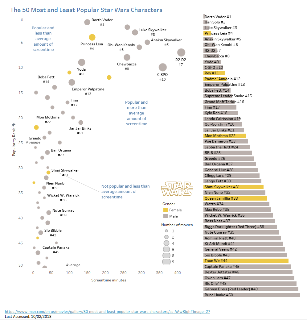
For the October scatterplot Storytelling With Data Challenge, I chose a data set with a theme that I thought fit nicely with the month of October: Star Wars Characters--always a favorite Halloween costume category. I wanted to stick with a simple scenario, so I found a short list of 50 Star Wars most popular and unpopular characters. I decided to plot screentime and popularity rank and then added average lines to divide the scatterplot into 4 quadrants.
I took the following intentional steps to help focus the audience's attention on the important data:
I used position and reversed the y-axis rank numbering so that the most popular characters, represented by circles, appeared at the top of the scatterplot, where the audience would most likely look for top performers.
I used circle size to represent the number of movies the character has appeared in to show whether or not there was a possible correlation between number of movies and amount of screentime, affecting popularity rank.
I used color to show gender differences, which clearly communicated a wide disparity in the number of male vs. female characters.
I added labels to the quadrants providing a quick way for the audience to categorize the characters.
Additionally, I decluttered the scatterplot according to the Storytelling with Data clean design principles: I removed unnecessary gridlines and borders. I used the Tableau Viz in Tooltips feature to give the audience an additional way to dig deeper into the data and learn more about the characters without adding more information to the already busy scatterplot. I made up for missing labels by adding a bar graph sorted by popularity next to the scatterplot so that the audience could quickly see the list of characters included.
The conclusion
Practicing clean design in the field of data visualization is effective in keeping your data in its rightful and pivotal place in your data story. Cole is a champion of this practice and reminds us of the importance of sticking to the basics when we are tempted to overembellish charts, giving our audience a bad case of cognitive overload. It’s just not necessary, so why go there?
If you want to learn more from Cole and her work, check out her website along with this video to give you a glimpse of what her workshops are like. You can also follow Cole on Twitter to keep up on the latest news in data visualization in the business world.

The Top 10 Tableau "Asking for a Friend" Questions
When starting out with Tableau, there are some things that trip up newbies--things that many tried and true Tableau users have known for awhile and assume everyone else already knows. Newbies are embarrassed to ask these questions and can't quite find the straight answers easily on a Google search, hence the reference "Asking for a Friend".
When starting out with learning Tableau, there are some things that trip up newbies--things that many tried and true Tableau users have known for awhile and assume everyone else already knows. Newbies* are embarrassed to ask these questions, hence the use of the phrase "Asking for a Friend". Here are some of those questions.
*Remember that I am a bit of a newbie myself, so feel free to provide better answers or add any questions that I missed by adding a comment below. In fact, since I first published this post, I have learned that I was wrong on some of the finer details and so I have edited the content of this post with a few corrections.
1. In Tableau, what is the difference between a dimension and a measure?
A dimension is field that is qualitative (categorical) and not a number. So if you are visualizing Superstore data (one of the sample workbooks that comes with Tableau Desktop) customers and sales, Customers is a Dimension and Sales is a Measure.

A big misconception to note:
“Dimensions are always blue pills and measures are always green pills.” THIS STATEMENT IS FALSE.
Blue pills represent discrete data and green pills represent continuous data. THIS STATEMENT IS TRUE.
Okay, then the next question: What is the difference between discrete and continuous? Discrete fields can be sorted while continuous fields cannot be sorted. Usually, this is pretty straightforward but sometimes fields such as dates can be classified as either discrete or continuous.
The best example of using a date as discrete or continuous: A date (month) can be sorted and plotted on an x-axis by month category with a bar graph. This is an example of discrete.

A set of dates that is continuous can be plotted on the x-axis as continuous with a line graph containing many months over many years. This is an example of continuous.
The good thing is that most of the time Tableau is pretty intuitive and recognizes the difference between discrete and continuous, so when you connect to the data and open the workbook, the data usually ends up in the right spot, making this the least of your worries. If you need to change a date from discrete to continuous, you can do so by editing the field and specifying year, quarter, etc.
2. What is a .twb and how is it different than a .twbx?
A .twb file is a Tableau workbook that does not contain data. It's basically an empty shell or template that won't open at all, or if it does, it does so as an empty Tableau workbook, showing the user nothing. You can send a data extract file along with the .twb, but that is a hassle for the user, especially if they are unfamiliar with how to connect data in Tableau.
Don't send a .twb unless your user is expecting it and knows how to connect to the data source. Instead, package your workbook with a data extract and send a .twbx file (Tableau workbook with data extract).
3. Now that I know the difference between a .twb and a .twbx, what is a Tableau Data Extract (TDE) and how do I get it?
A Tableau Data Extract (TDE) is simply that--the data extracted from your data source that is packaged with your .twb. In other words, ".twb + data extract = .twbx". This is the preferred format for sending Tableau workbooks. Don't frustrate your recipients by sending a .twb instead. To understand completely the concept of Tableau Data Extracts, read this detailed blogpost. If you are in a hurry and just need to know how to save your workbook as a .twbx, go to the Data Source tab at the bottom of your workbook, choose Extract under Connection in the top right corner of the Data Source screen > Edit > Save. Then once you save your workbook, your data extract will be included. If you don't want to save all of the data and would rather limit the amount of data saved in the extract, refer to these instructions. Another easy way to save an extract from the very beginning is choose the Extract option in the Data Source Connection area.

A helpful tip: If you receive a Tableau workbook (.twbx) as an attachment and you want to see the raw data behind the workbook, change the .twbx file extension to .zip and then unzip the file.
4. What is Tableau Public and how do I publish my work there? Who then can see my work?
Tableau Public is a free tool and repository that allows anyone to use Tableau. You can use your Tableau Public profile as a portfolio or a sandbox to play around with as you visualize public data sets.
Download and use the Tableau Public software to create workbooks and then upload your workbooks (or a workbook created in Tableau Desktop) into a Tableau Public user profile that you create for yourself. Simply open your workbook--making sure you have a data extract saved--and choose the top tab Server > Tableau Public > Save to Tableau Public > Saved!

Warning: If you don't save a TDE (Tableau Data Extract) before trying to save your workbook to Tableau Public, you will get this message, preventing you from saving your workbook to Tableau Public until you first save the data extract. See instructions above for how to save a data extract.

You can even embed visualizations into your own website, if your webhost allows you to embed Tableau Public links. Just choose the Share button located below your dashboard and copy and paste the embed code into your webpage.
Caveat: Anything you publish to Tableau Public (as in data sources) is considered in the public domain (even if you toggle the workbook eye icon visibility to hidden in your profile); therefore, be sure to refrain from uploading any workbooks using proprietary data sets.
Super helpful feature that I learned from Kevin Flerlage on how to share your Tableau Public viz on Social Media so that it displays as a thumbnail instead of just the top corner of your viz:

Open your Tableau Public profile.
Choose the viz you want to share.
Select the share button on the bottom of the viz.
Copy the Link URL (not the embed code) and copy it into a text editor like Notepad and add ":showVizHome=no" to the end of the code. Here’s the original share code from one of my vizzes:
https://public.tableau.com/shared/TKYHBRDTR?:display_count=yes
And after adding the “:showVizHome=no”
https://public.tableau.com/shared/TKYHBRDTR?:display_count=yes:showVizHome=no
Try both out to see the difference.
You can now use this link to send out your viz giving your users a better experience in viewing your whole viz instead of just a corner of your viz.
Even better: If you want users to see your viz in your own blog (after they exit out of your viz), add a Permalink to your viz by editing details and saving. Then use this permalink (without adding any extra code) to share your viz and blogpost related to your viz.
Here’s mine:

*Helpful tip: In addition to using this method to post your visualization to social media, use this format when sending the viz link via email or text to anyone who may be opening your viz on mobile.
Check here for more information about how to use Tableau Public.
5. What file type is a .csv considered when connecting to data?
A .csv file is a comma-separated values file and Tableau sees it as a text file, not as an Excel file. When connecting to data in Tableau using a .csv file, remember to choose "Text file".
6. What do I do when my numbers don't import correctly (e.g. return null values, return 1899 or 1905 for every date, etc.)?
It all depends. There are variations of problems involving connecting to data where Tableau changes the format to something other than what you were expecting. Take a deep breath and check to see how Tableau has classified your data (string, number, etc.). Sometimes, if you change the format, it just might fix the problem. Here is a post that addresses many of the most common problems encountered and the calculated fields recommended to remedy those problems. The specific 1905 date solution is to change the data type to string and to create a calculated field. Here is more information on the steps to how to make this happen.
Sometimes you will need to split a date and time column. Tableau Prep can help you solve these problems. If your problem is complex, and you are still unable to solve it, resort to finding solutions in Excel. Initially shaping your data in Excel can limit the chance of problems occurring when connecting the data in Tableau.
7. Should I use tiled or floating containers when designing a dashboard layout?
Beginners may want to start with tiled containers, but not necessarily. Floating containers offer more in the way of controlling size and allow for more creativity, but can be tricky to use. It is a good idea to try your hand at both to see which one you prefer to use. For straightforward projects, tiled containers may be easiest to use.
8. What size dimensions should I choose for my dashboard to make my workbook load correctly on any device?
Consider which device the reader will be using to view the dashboard. Choose the dashboard layout size dimensions that match that device. Caveat: "Automatic" is an option that is designed to allow the dashboard to load properly on any device, but it doesn't always work perfectly. Test it on the device to make sure it gives you the display you expect. Really, the easiest solution—if you are sharing for mobile and desktop—is to use the process for Social Media sharing mentioned above (#4).
9. Can I share a workbook with someone who doesn't own Tableau?
Yes, but it is necessary for the recipient to first download Tableau Reader in order to be able to open and interact with your workbook.
10. Is Tableau Prep a part of Tableau Desktop or is it a separate download from Tableau Desktop?
Tableau Prep is a separate download from Tableau Desktop. You use the same key to get the download, though. It loads as a separate application on your device. You prepare/shape the data in Tableau Prep and save it as a Tableau Prep Flow File (.tfl). Installation instructions for Tableau Prep is located here.
I'm admittedly still a newbie in using Tableau. I just picked up the book, Practical Tableau, by Ryan Sleeper and am working through the examples used in each of his 100 chapters and am learning a lot. I highly recommend it!
If you are contemplating whether or not you should share your story, check out my recent blogpost about why it's a good thing, even if you don't consider yourself a genius or an expert.