Storytelling with Data
The book
I was first introduced to Cole Nussbaumer Knaflic’s book, Storytelling with Data while I was a student in the University of Washington Data Visualization Certificate Program, where I currently serve in the role of grader. Cole’s book had an instant appeal in that it offered a practical approach to data visualization in contrast to the more academic based approach taken by other books on the topic. Incidentally, Storytelling with Data along with Alberto Cairo’s The Truthful Art: Data, Charts, and Maps for Communication and Edward Tufte’s, The Visual Display of Quantitative Information are my top three must-read books for anyone interested in learning the basics of data visualization.
In her book, Cole clearly guides the reader on how to visualize data the right way and demonstrates just how surprisingly easy it can be to build effective charts for a business setting. Too often we build charts that are so complex that only a select few can understand them. Instead, Cole shows how choosing the right visual, stripping away clutter, and using good design principles, can help focus the attention on the important data in order to get the main point across to an audience.
The workshop
I had the privilege of attending and helping with set up at Cole’s all-day in person workshop in Seattle this past spring. Cole divided the workshop into several lessons--giving emphasis to each major learning concept. The use of repetition and compelling real life scenarios for each concept helped encode important points to memory. The "big idea" of trying to help people do things in smarter ways came through clearly. The key principle of using data as a pivotal point in an overarching story was demonstrated effectively time and time again.
Major takeaways
1. Know your audience before creating content for your data story. Know their background, biases, and the data available.
2. The big idea in your data story should articulate your point of view, convey what's at stake, and should be in the form of a complete sentence.
3. Be able to communicate your big idea in 3 minutes or less and envision what a successful outcome will look like.
4. Storyboard your communication up front to keep yourself on track and reduce iterations. Cole used the narrative arc method and helped us arrange components of our story using sticky notes.
Simply put, I highly recommend Cole’s workshop. Cole’s rare talent in presenting her material in such a polished way creates a captivating and unforgettable experience for her audience. The principles learned easily resonate and stick with you beyond the workshop. Applying these learned principles will bring incredible value back to your organization.
The podcast
Cole offers a thought provoking podcast that provides yet another way to encode the clean design concepts and practices into your brain. She interviews fellows experts in the field and offers up some good entertainment with her pie chart bashing and insightful book reviews. You can access her podcast through your phone music app or via this webpage.
The challenge
Each month, Cole announces a Storytelling with Data Challenge (Twitter hashtag #SWDchallenge) to her followers, giving them one week to create (or improve) a chart using straightforward design principles that clearly communicate the message. Each month she chooses a new theme. The theme for October is creating a scatterplot. Here is my submission:
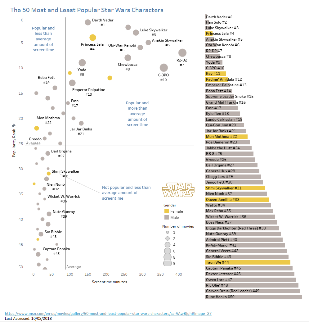
For the October scatterplot Storytelling With Data Challenge, I chose a data set with a theme that I thought fit nicely with the month of October: Star Wars Characters--always a favorite Halloween costume category. I wanted to stick with a simple scenario, so I found a short list of 50 Star Wars most popular and unpopular characters. I decided to plot screentime and popularity rank and then added average lines to divide the scatterplot into 4 quadrants.
I took the following intentional steps to help focus the audience's attention on the important data:
I used position and reversed the y-axis rank numbering so that the most popular characters, represented by circles, appeared at the top of the scatterplot, where the audience would most likely look for top performers.
I used circle size to represent the number of movies the character has appeared in to show whether or not there was a possible correlation between number of movies and amount of screentime, affecting popularity rank.
I used color to show gender differences, which clearly communicated a wide disparity in the number of male vs. female characters.
I added labels to the quadrants providing a quick way for the audience to categorize the characters.
Additionally, I decluttered the scatterplot according to the Storytelling with Data clean design principles: I removed unnecessary gridlines and borders. I used the Tableau Viz in Tooltips feature to give the audience an additional way to dig deeper into the data and learn more about the characters without adding more information to the already busy scatterplot. I made up for missing labels by adding a bar graph sorted by popularity next to the scatterplot so that the audience could quickly see the list of characters included.
The conclusion
Practicing clean design in the field of data visualization is effective in keeping your data in its rightful and pivotal place in your data story. Cole is a champion of this practice and reminds us of the importance of sticking to the basics when we are tempted to overembellish charts, giving our audience a bad case of cognitive overload. It’s just not necessary, so why go there?
If you want to learn more from Cole and her work, check out her website along with this video to give you a glimpse of what her workshops are like. You can also follow Cole on Twitter to keep up on the latest news in data visualization in the business world.