Visualizing Variance
This month’s Storytelling with Data February Challenge is to visualize the variance. Since Valentine’s Day is almost here, I chose to visualize* a simple Valentine’s Day data set with a boxplot to show variance over time with age groups and whether or not they had changed their minds about celebrating Valentine’s Day.
I first visualized each category as a small multiple line chart and then layered the corresponding boxplot over each chart. Using Tableau’s Analytics pane made it simple to add the boxplots. For added effect, I included a photo of a celebrity couple from each of the age groups above the charts to make the dashboard memorable. I also added the heart as a washed out background image in the charts to help give perspective on where the line and boxplot were plotted when comparing the charts.
Hovering over the boxplots reveals all of the quartile ranges. I added annotations to show the age groups with the most and least variance. Hovering over the line will show tooltips that provide specific information on percentages and years.
The Tableau Public workbook is published here and is also accessible below.
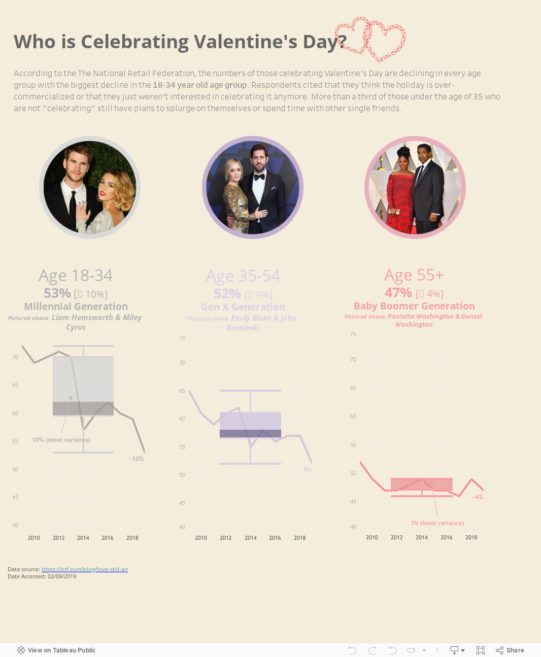
As you can see, the most variance occurs in the 18-34 age group (19%) with the least variance occurring in the 55+ age group (3%).
It was both timely and inspirational to have just watched Anna Foard’s session on Stats for Dataviz: Percentiles & How to interpret a box-and-whisker plot. I also highly recommend her blogpost on the topic.
*I plan to keep making improvements and adding features to this simple dashboard, beyond the #SWDChallenge. That’s what is so great about participating in the #SWDChallenge—it keeps you thinking about new ways to create.