My Top Ten Questions About Dashboards
When did dashboards become so ubiquitous? Are they here to stay or are they just a fad? I needed answers to these questions before I felt good about investing precious time in learning how to design dashboards. However, one question led to another and then another. I bet you and others have these same questions. So here it is—my top ten questions and answers about dashboards. I’ll include images that I’ve collected along the way in my journey to learn more about dashboards.
First of all, if you are like me, you like to see every step in the process—leave no stone unturned—when you are learning something new. That is the approach I take here while learning about dashboards. I find that if I skip over any of the most fundamental steps, I always feel lost at some point. I hope I included most of the fundamental questions. I don’t want to leave you in the dark if you are a beginner, so if you find that I have left out an obvious question, please let me know.

1. What is a dashboard? A dashboard (like the sample Tableau dashboard pictured below) is primarily a collection of charts that offers a quick status report of how the KPIs (Key Performance Indicators) are doing. If you want to dig deeper into the definition, you can learn more by checking out some of the resources listed at the end of this post.

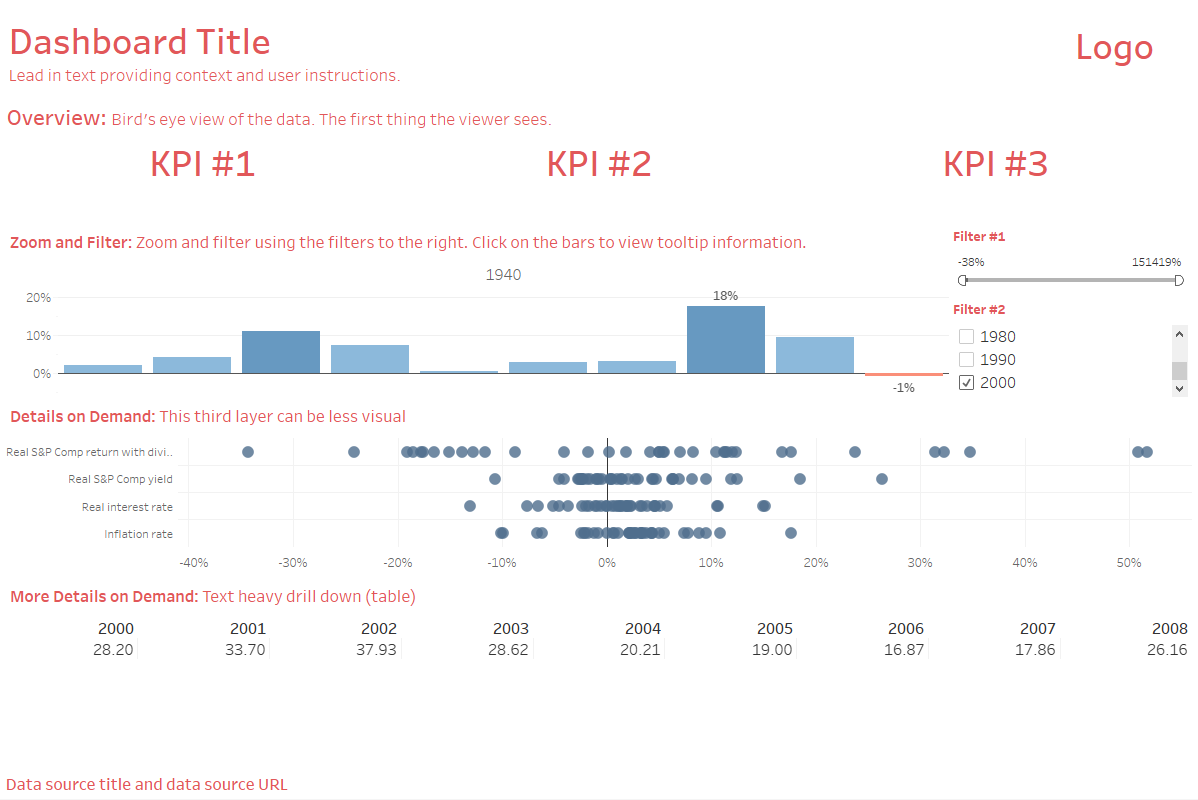
A sample workbook dashboard found in Tableau Desktop.
2. Why are dashboards necessary? Aren’t simple charts good enough? Dashboards work more efficiently than a set of charts that are shown one at a time because “eyes beat memory.” When I first heard this phrase, I was unsure of its meaning. What it means is if you show someone a series of charts relating to the same subject and then ask them if they remember the information from the first chart, it’s likely they have forgotten that information. If you instead show them all of the charts in on one view, they don’t have to rely on their memory to recall what was on the first chart since their eyes can see all of the charts in one view.
3. Why are dashboards used in the business world? I found it incredibly interesting to learn that dashboards didn’t gain serious ground until the Enron scandal, which served as a wake-up call to corporations of the need to keep a closer eye on their performance. Since then, dashboards seem to be popping up everywhere.

4. What is the main characteristic of a useful dashboard? You know a dashboard is useful if it quickly communicates a clear message and a call to action to its intended audience. It’s that simple. Dashboards don’t have to be complicated. The main problem with most ineffective dashboards is that they become too complicated to the point of cognitive overload. People are easily overwhelmed and their attention span is short, so if it takes them more than a few seconds to understand a dashboard, you lose them.
5. What is a good dashboard template to use? I learn best by following examples, so here’s a basic template I built using the principles found in Ben Shneiderman’s Information Seeking Mantra, a dashboard layout template example found in Ben Jones’ Communicating Data with Tableau, and then combining it all with one of the sample workbook dashboards included in Tableau Desktop.
6. Beyond using a template, what is the most effective design philosophy to use in dashboard building? You can quickly learn to think like a designer by using the clean design principles outlined in Storytelling with Data: A Data Visualization Guide for Business Professionals. by Cole Nussbaumer Knaflic. It’s an easy read and places you on the fast track to getting your dashboard built.
7. Should I include images in my dashboard? Adding the right images can make your dashboard memorable. If you are using a persona and a scenario to make the numbers more alive, then adding a face to your dashboard can help your audience make an emotional connection with the people (or animals) who represent the data points. Here’s an example of how using the face of a rhino grabs our attention and causes us to make an immediate connection with the dashboard. Interact with the dashboard here.
Dashboard designed by Eve Thomas featured on Tableau Public.
8. Who should build dashboards? Ideally, the people who use dashboards should build them. It’s true! People place more value on their own creations than those of others. This bias has been called “the Ikea effect”. It seems that even though we don’t cut down the trees and prepare the materials to build our Ikea furniture, just the act of assembling the furniture makes us value it more. This bias seems to hold true for dashboards.
Ask the stakeholders which metrics mean the most to them and then have them add those top priority numbers as KPIs and include interactive charts below the KPIs allowing them to explore the data. Most dashboard building software allows users to drag and drop objects into an empty dashboard template so everyone can build (or assemble) their own dashboards—just like assembling Ikea furniture! Then there’s this effect that happens—because we built it and know how much time we put into it—we value it more than if others built it for us. It’s a part of what’s known as self-service BI philosophy.
9. Are dashboards here to stay? This seems to be the case. You can study the report from Gartner and find out that that BI tools have now become mainstream purchases for businesses.

Gartner Magic Quadrant: A scatterplot showing the rankings of all of the major business intelligence software on the market as of January 2019.
10. What are some good resources for building dashboards? Some of the following links are Tableau specific resources but also include a lot of good information on general dashboard design principles. Happy dashboard building!
Books
Communicating Data with Tableau
Online Free Resources
Dashboard Design by Interworks
Dashboard Design Examples

