Rebranding A Chart
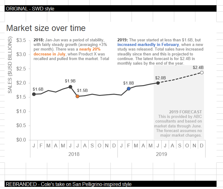
This month’s Storytelling with Data Challenge from Cole Nussbaumer Knaflic is to rebrand a chart. In her blog post, Cole shows us the steps she took to rebrand a chart with the San Pellegrino brand. It really helped that Cole provided a data set as well as before and after images of the charts she created.
Step 1: Pick a brand
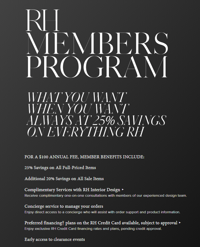
Although there were so many great brands to choose from, I ended up choosing the Restoration Hardware brand—my favorite home furnishings retailer! I absolutely love visiting the local store here in Seattle. I could not find an official Restoration Hardware style guide online, but I found a few links about the ideas behind the brand and information about fonts that can be used to match the font style. Here are a few images (hey—that’s my favorite sofa in one of the photos) that are typical of the Restoration Hardware brand and ads (Note: All images are the property of Restoration Hardware):


Step 2: Connect the data to Tableau
I used Tableau Desktop to connect to my data and build my chart and dashboard. Connecting to data is easy with Tableau. I downloaded the Excel document from Cole to my local drive and then connected the data.
Step 3: Create a line chart in Tableau
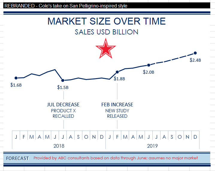
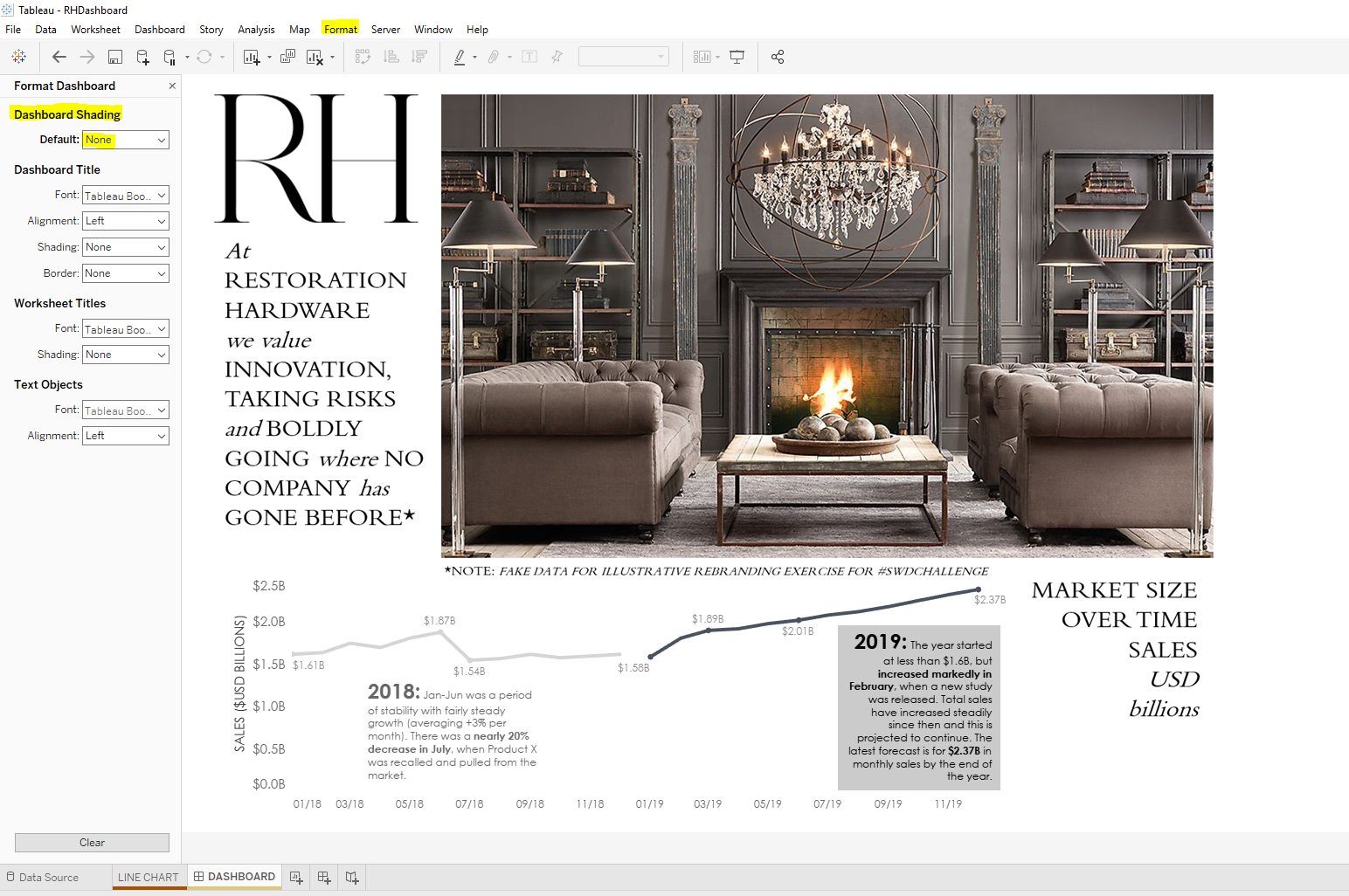
I added the Date dimension to Columns and the measure Sales (SUM) to Row. I added annotations that matched Cole’s example and changed the formatting to try to match the Restoration Hardware font (Century Gothic). I also played with the size of the font making the year bigger and bolder and adding bold text to the KPIs included.

Labels were all added to Sales to begin with. I then right clicked and chose to hide the data point labels that weren’t a part of the big story (and to match Cole’s example).
I also did little things such as changing the number format on the y-axis (right click Format > Pane tab > Default > Totals ? Numbers) to Currency (Custom) and add B to Suffix to abbreviate billions.

Instead of using the analytics feature in Tableau for forecasting, I used a darker shade for the 2019 annotation background (Right click on annotation and choose Format. Change Shading to 69%). You can pick any color you want for the annotation box background. On Shading, choose the down arrow and “More colors …”. There you can choose “Pick Screen Color” and select the color you are trying to match.

Step 4: Create a transparent dashboard in Tableau
Making a dashboard background transparent is so incredibly easy in Tableau. Simply create a dashboard and choose the tab at the top Format > Dashboard > Dashboard Shading > Default > None.
Step 5: Create a dashboard background image in PowerPoint
Now if you have your image and it is your only background choice (sized right, wash out is optimal, etc.) then in the Object section of your dashboard (left bottom corner) set your dashboard to Tiled and select Image.
In my case, I wanted to add a few text boxes in addition to the photo. I also knew that one of the fonts I wanted to use was readily available in PowerPoint but not in Tableau.
Here’s how my PowerPoint looked after I added an image and a few text boxes. I then saved the slide as a .png file on my local drive.
Note: If I want to change the background color of any of the text boxes I could match the grey in the picture by using the Eyedropper tool in PowerPoint.

Step 6: Add PowerPoint background image to Tableau dashboard
On Dashboard > Objects > Image (Make sure you are on Tiled) > Choose image from your local drive > Choose Fit Image (add a target URL if you want your audience to click on the image and go to another website. This probably isn’t what you want for a background image, though) > Choose Okay.

Step 7: Add chart to dashboard
Choose Floating and add the line chart to the dashboard. Resize until it looks right. (Keeping the gridlines option on helps to line things up. Gridlines can be turned on by choosing Dashboard tab > Show Grid. Just be sure to turn this option off before sharing your dashboard).
Note: If you have an object overlapping a chart or vice versa, you can change the Floating order of objects when you are in the dashboard. Just click on the object, choose the down arrow and select Floating Order and move object to front or back.
Step 8: Finishing up
There’s never an end to tweaking where dashboard design is concerned. Little things like text placement, text color, etc., are important in addition to the actual data that is being visualized.
The funny thing is—in the midst of my extensive googling—I found that Restoration Hardware had once carried a book about the history of typography. It looks interesting and I bet I could learn a lot from it.

So as a result of participating in this month’s Storytelling with Data Challenge, I now have a new appreciation for all the work done by graphic designers, typography experts, and those who develop brand guidelines for organizations.
Here it is: My finished project! Now time to take a break and plop down on my comfy RH sofa for a bit!
