
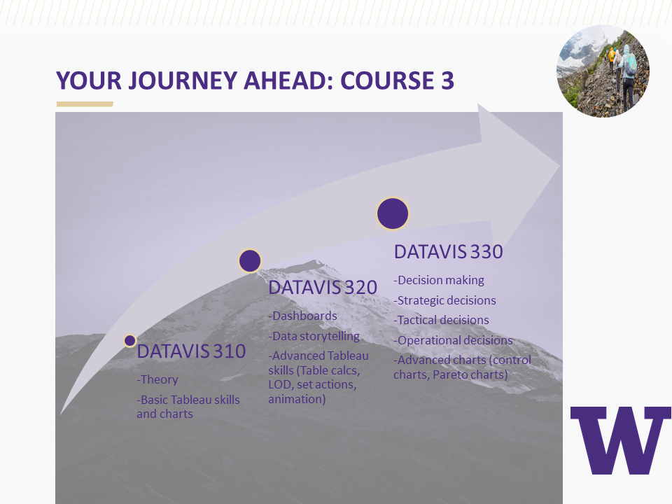
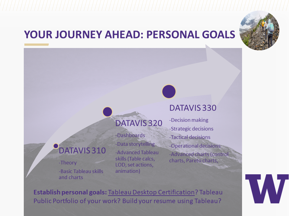
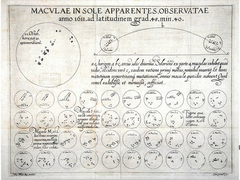
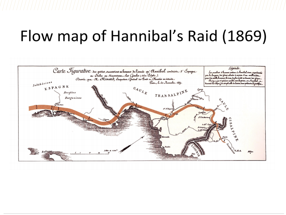
Ten Weeks of Learning Data Visualization
Transforming a spreadsheet of numbers into a data visualization can happen with a few simple steps if you use Tableau's drag and drop features. But unless you know a little about the theory, history, and cognitive psychology behind what makes a "good" data visualization, your design efforts might be in vain. So the question is: How much do you need to know before building a good data visualization?
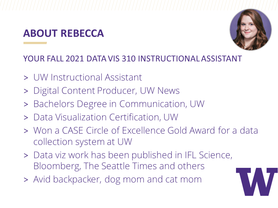
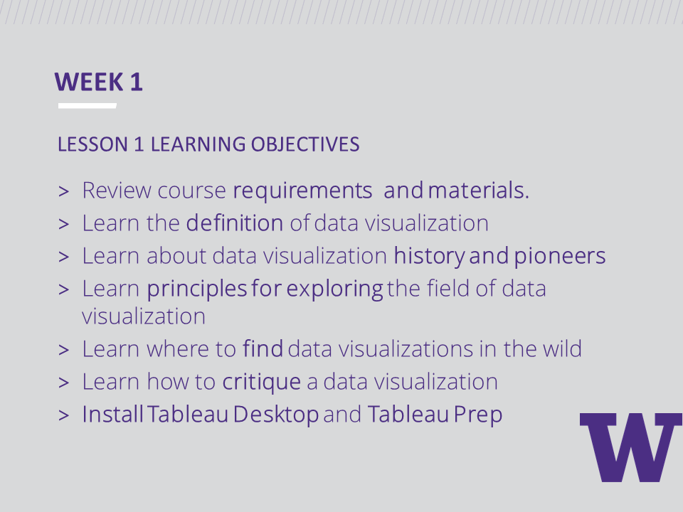
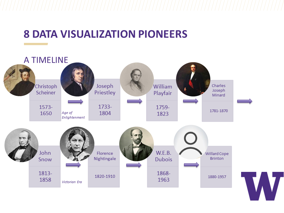
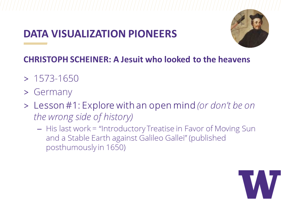
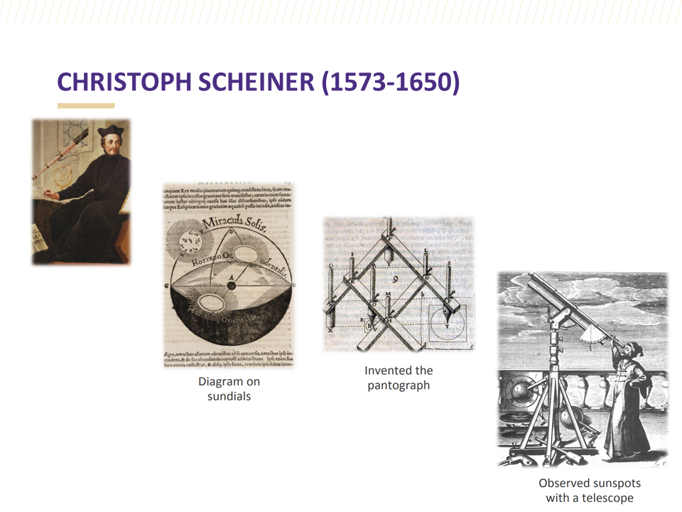
As members of the University of Washington Data Visualization Certificate Program instructional team, Rebecca Gourley and I recently had the privilege of guiding students through the first ten weeks of the data visualization learning journey. This first course in the certificate program walks students through data visualization history, theory, and best data visualization design practices. While students build a solid foundation for data visualization knowledge, they are also challenged weekly to develop technical skills by designing basic charts using Tableau.
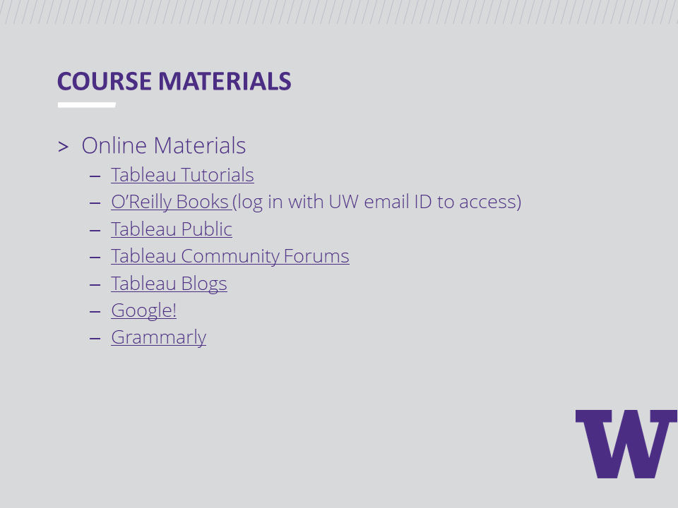
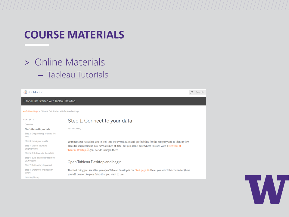
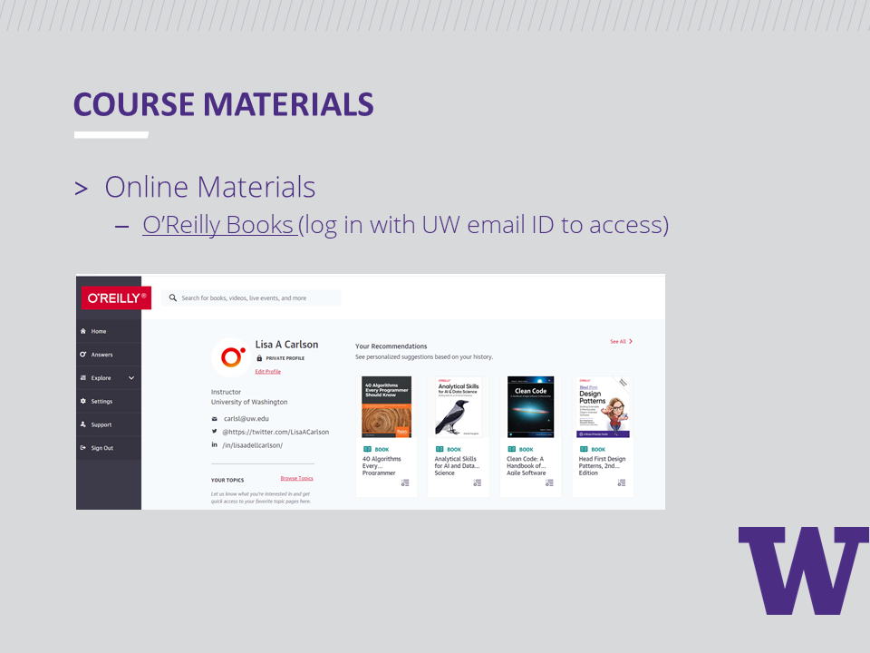
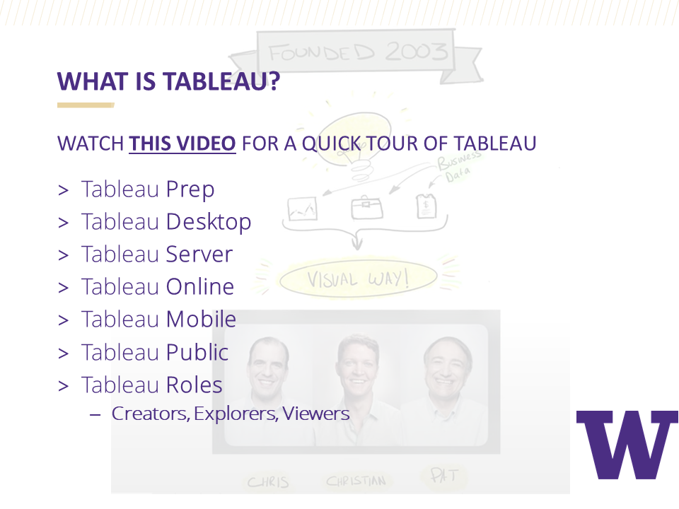
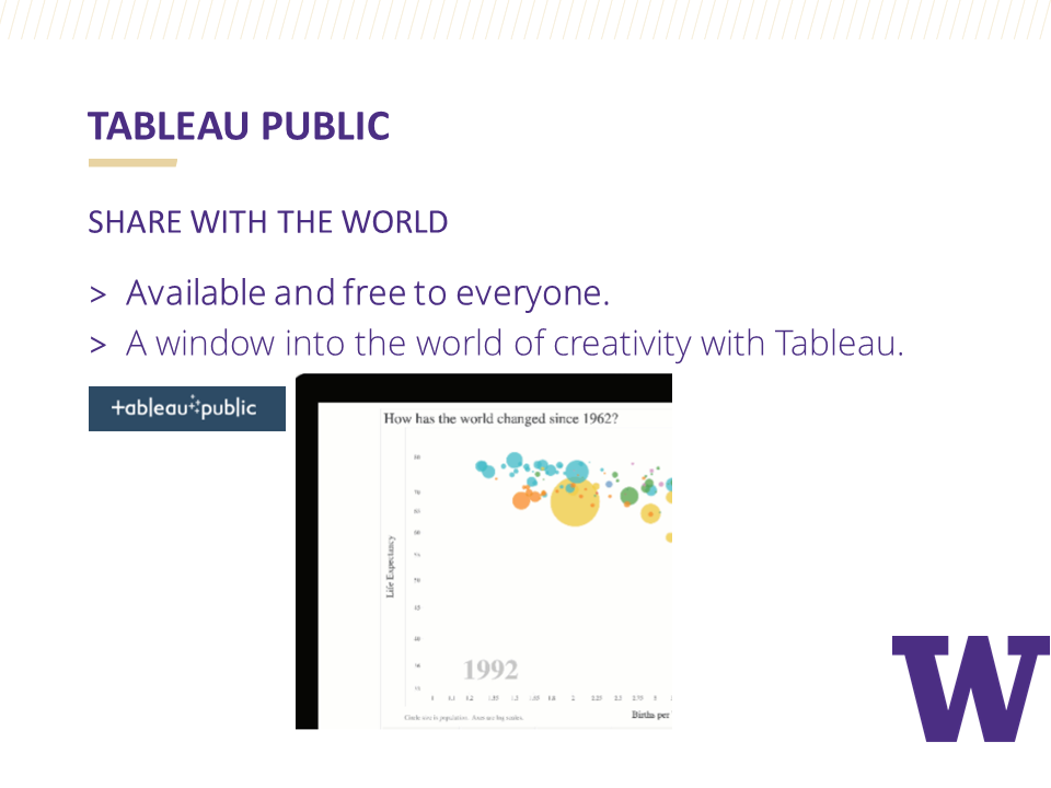
Before Week 1 began, we provided students with a free Student Tableau Desktop License and free access to Tableau tutorials. Students were also encouraged to read the recommended books listed below according to a reading schedule provided. Note: All O'Reilly e-books were free for the students with their UW student ID.
Our books
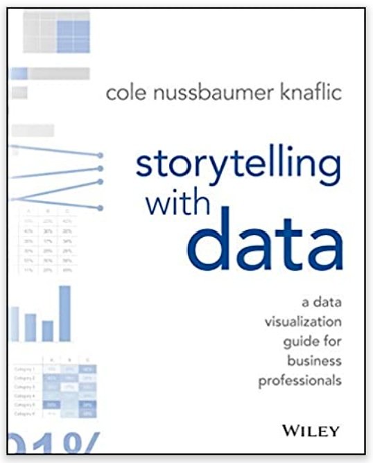
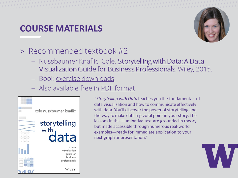
Storytelling with Data: A Data Visualization Guide for Business Professionals by Cole Nussbaumer Knaflic
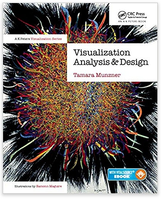
Visualization Analysis & Design by Tamara Munzner
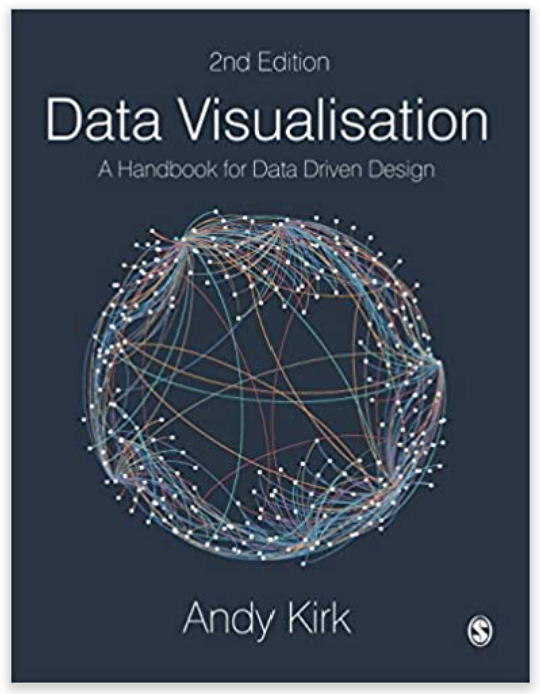
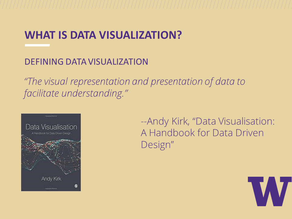
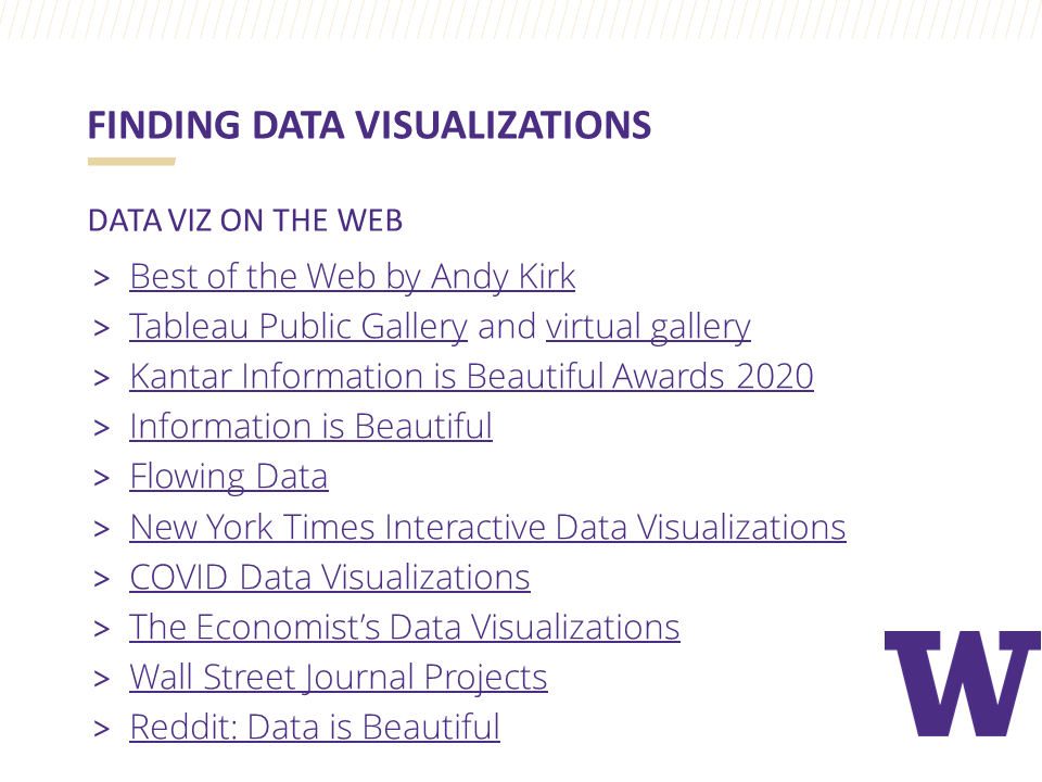
Data Visualisation: A Handbook for Data Driven Design by Andy Kirk
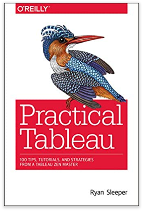
Practical Tableau by Ryan Sleeper
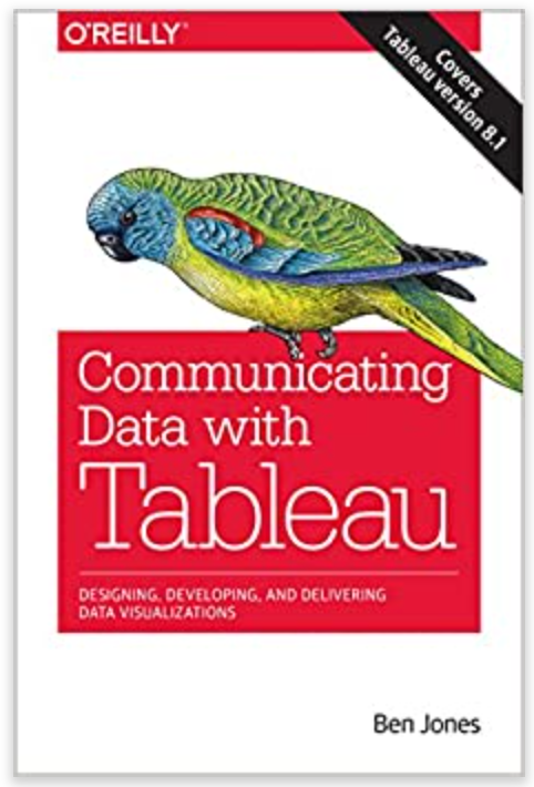
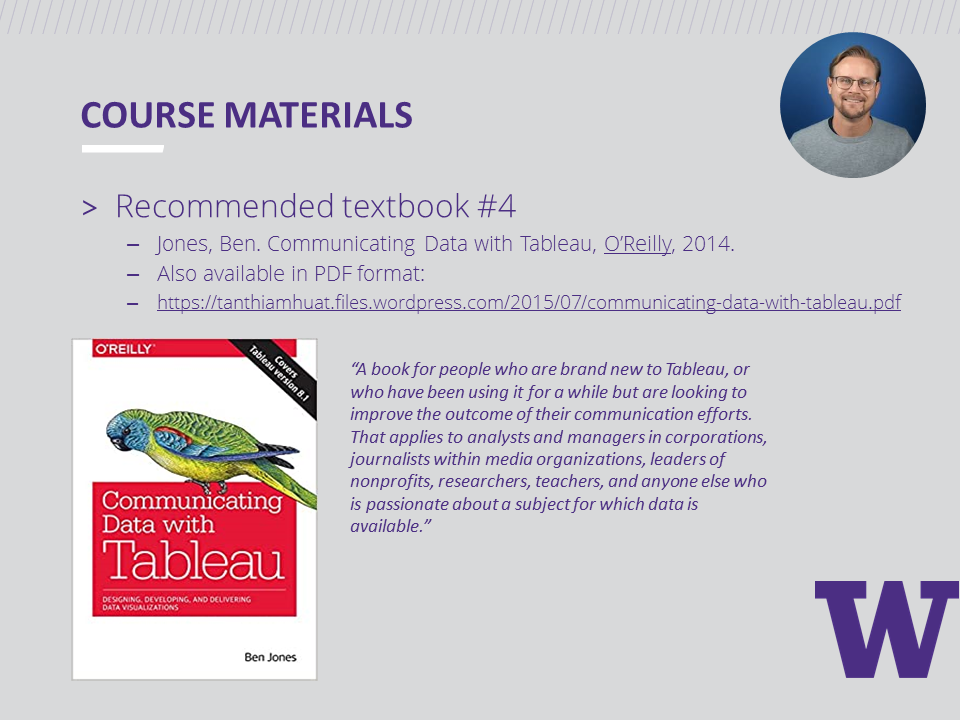
Communicating Data with Tableau by Ben Jones
Our weekly sessions
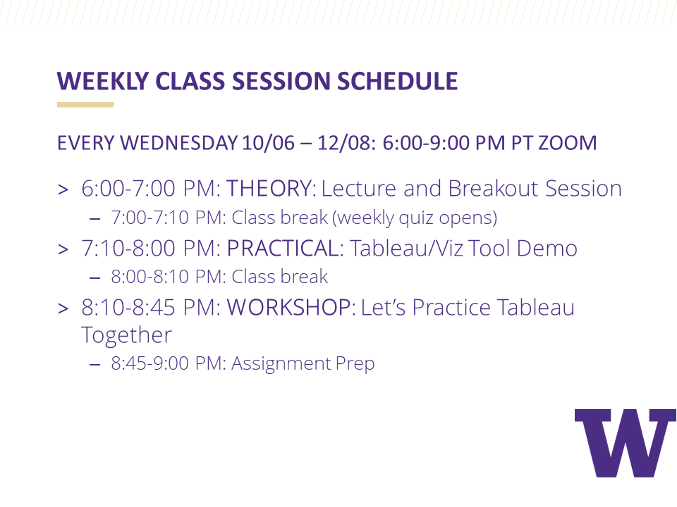
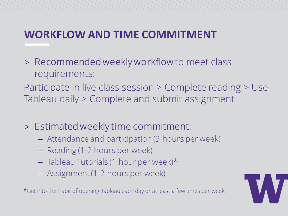
For ten consecutive weeks, our class of twenty-nine students logged in from various locations and time zones for three hours every Wednesday evening. During each session, we covered theory before diving into the practical application by building basic charts with Tableau.
During the week, students finished an assignment requiring them to build a new chart type each week. Rebecca Gourley helped students when they needed assistance with data wrangling or chart building challenges that required advanced Tableau skills.
The slide deck from our first session provides more details about the program and also shows how we typically break up a three-hour class session.


Our special guests
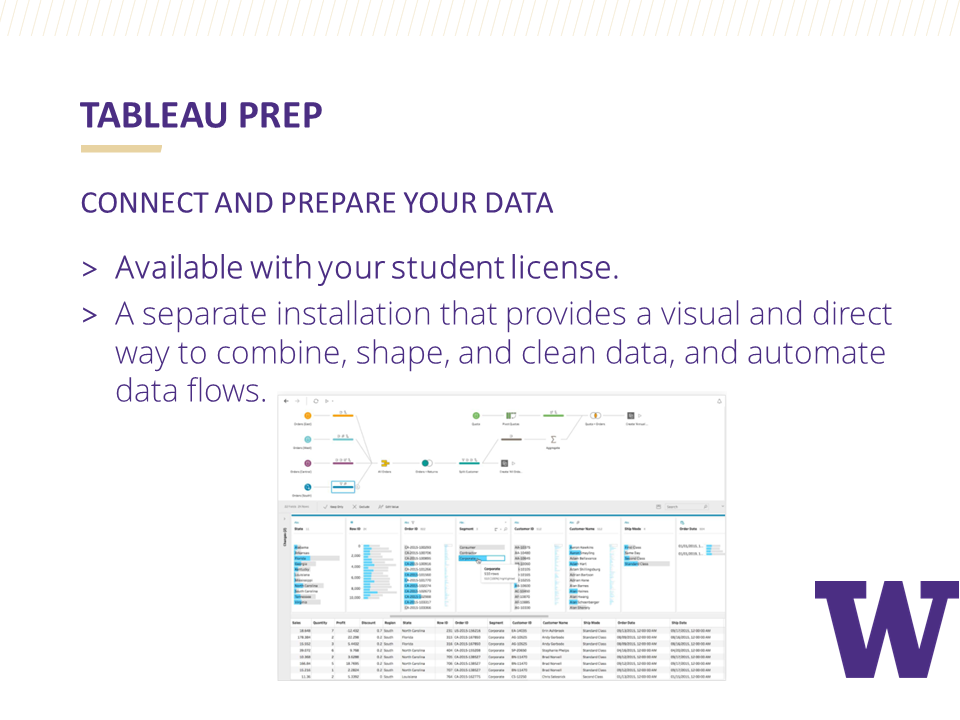
We added some spice to our sessions by having a couple of special guests join us. During Week 3, Carl Allchin, the author of Tableau Prep, introduced us to how Tableau Prep works using a helpful step-by-step demo where students followed along.

We then welcomed Kevin Flerlage as our guest during Week 9 where he shared Simple Steps for Better Design. After his presentation, Kevin spent time answering students' questions about his Tableau journey and the field of data visualization.

In preparation for student final project presentations, in Week 8’s session, we reviewed resources provided by Alex Velez of the Storytelling with Data Team. Alex has visited our classroom in person in the past and shared some great SWD resources with us so that students can learn how to practice delivering stellar data presentations.

Our Collection of Final Projects
Here are just ten final project examples where students visualized a data set of their choosing and then turned their visualization into a compelling data story. During our last class session, each student presented their data story in just 3 minutes using Cole Nussbaumer-Knaflic's Big Idea 3-minute story method found in Storytelling with Data. These final project submissions on their own seem to tell a story, but having students present their stories made them that much more memorable.
#1: Matt’s Project | California Wildfires
Matt took a deep dive into exploring the data behind California wildfires. He visualized the most destructive fires and used KPI's to highlight the more incredible data insights. You can check out Matt's interactive version of his dashboard here.

#2: Stephanie’s Project | The Big Brother House Guests
Stephanie is a big fan of the Big Brother House and spent weeks curating her data set to build a dashboard that allowed the user to filter for seasons and elimination weeks. Check out Stephanie's interactive dashboard on Tableau Public.

#3: Lynn’s Project | The History of Women in the Boston Marathon
Lynn’s dashboard powerfully communicates the history of The Boston Marathon and gender equality. She effectively uses annotations to point out key events in the timeline. Check out Lynn's interactive dashboard on Tableau Public.

#4: Rose’s Project | The Heritage Trees of Seattle
Rose’s exquisite dashboard explores the heritage of trees in Seattle. Her dashboard is a perfect textbook example of Ben Shneiderman's Information Seeking Mantra applied to dashboard design: Overview First (Title and lead-in paragraph, KPIs) > Zoom and Filter (map and treemap) > Details-on-Demand (table). Check out her interactive dashboard on Tableau Public.

#5: Josh’s Project | Why is My Catalytic Converter Missing?
Josh used the Tableau Story Points feature to take us on a captivating journey of what is happening with stolen car parts in Seattle. The image below is Josh's opening story point. Interested in learning the whole story? Check out the rest of Josh's story on Tableau Public.

#6: Ron’s Project | Cash is King in Japan
Ron effectively compared the currency of households in Japan to other countries with a beautifully designed dashboard. Check out his interactive dashboard on Tableau Public.

#7: Miranda’s Project | Dance with Prince
Miranda’s Prince dashboard design is absolutely stunning! Be sure to check out her interactive dashboard complete with media elements on Tableau Public.

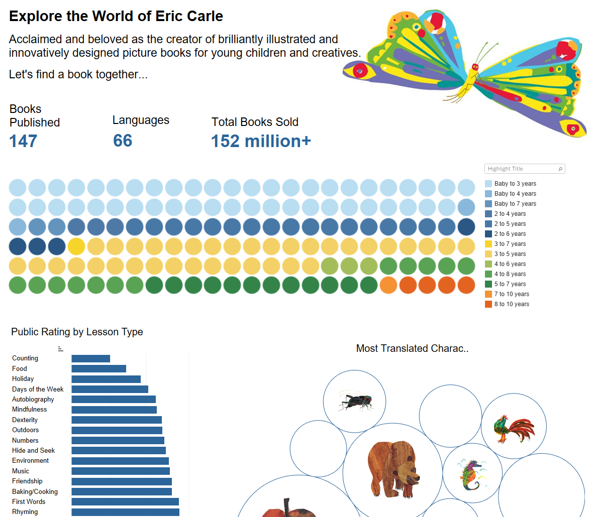
#8: Rachel’s Project | Exploring the World of Author Eric Carle
Rachel curated data from the works of Eric Carle and built a visually appealing dashboard to help her sister find just the right Eric Carle books for her niece to read. Check out Rachel's interactive dashboard on Tableau Public.
#9: Brandon’s Project | Bullish or Bearish
Brandon's dashboard tracks the history of the S&P 500. What makes his dashboard so exceptional is that he uses a zoom feature where the user can see the breakdown by month in a separate chart by selecting a point on the timeline. Check out Brandon's interactive dashboard on Tableau Public.

#10: Teagan’s Project | Shark Attacks in Australia
Teagan explored shark attack data in Australia and educated us on the history of shark attacks there since 1900. Did you know that helicopter shark patrols started in 2011 and seem to be working? Check out more interesting facts about shark attacks in Teagan’s interactive dashboard on Tableau Public.

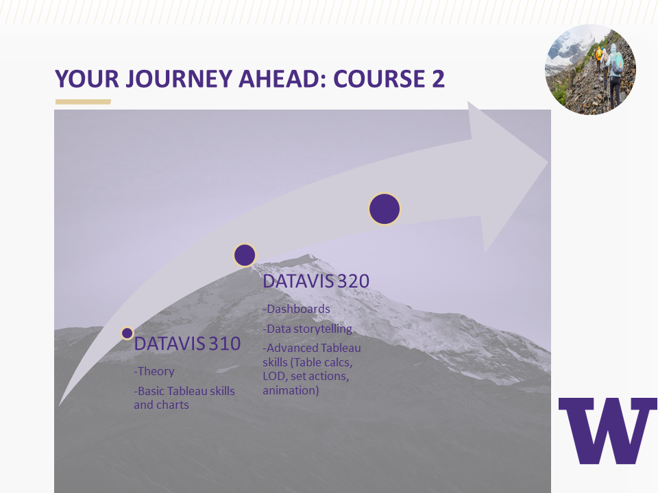
This cohort of students is just ten weeks into the program and have yet to take two additional courses before finishing the certificate program in June 2022. Their data visualizations already look amazing. I can't wait to see what they do next.
For more information about the University of Washington Data Visualization Certificate Program, visit https://www.pce.uw.edu/certificates/data-visualization.
