Using Tableau's Viz in Tooltips
I’m a fan of Tableau’s Viz in Tooltips feature. I use it as a way to add context to charts, maps, and diagrams. I am also a big fan of Charles Minard and his work—in fact my only regret on my recent trip to Paris is that I didn’t make it to the Ecole Des Ponts Paristech library where his work is kept. So for this month’s Storytelling with Data Challenge, I decided to honor and emulate one of Minard’s most famous data visualizations.
I really wanted to emulate (match or surpass an achievement typically by imitation) my favorite chart but I wasn’t sure how I could do this in a way that would bring honor to its creator, Charles Minard. I finally decided on the idea to add Viz in Tooltips as a way to gain a deeper understanding behind the detail included in Minard’s chart. Check out and interact with my viz here on Tableau Public or directly below.
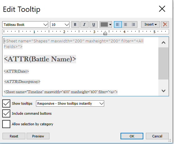
I searched Wikipedia and added information I found about the 7 central events in Napoleon’s Russian Campaign. This information appears in the tooltips that are activated on hover.
I used Tableau’s custom shapes feature to add Wikipedia’s pictures depicting each of the 7 events. I used a worksheet to filter these events and added the worksheet to the tooltips where they filter for each event.

I added a timeline to show the history of how the events fit together but I did not want the viz in tooltip to filter for each event which would essentially wipe out the line chart on hover. I found a great solution from Andy Kreibel on how to trick Tableau into not filtering for the worksheet by creating a dummy calculated field (a) to replace filter for all.

I credit Ryan Sleeper’s book, Practical Tableau, for providing clear instructions on how to add a background image as a map and then how to structure your data for mapping coordinates. Example: The Lookup row below is the pixel dimensions for the width and height of the photo I used.

The tricky part is getting the right size of image to import and making sure the pixel numbers match the mapping. Making sure the x field is for x is another important detail to get right.

Getting the coordinates right is surprisingly easy to do. Just find the place you want to place the data marker, right click, annotate, choose point, and the annotation screen pops up. Save it and the coordinates appear. Add these coordinate numbers to your x and y cells in your data source. Refresh your data source and remember to delete the annotations once you are done.

It’s that easy!
If I had more time I would try to emulate John Emery’s replication of this chart. I would also incorporate RJ Andrews’ recommendations on font choice when emulating Minard’s work:
Title block: REDONDA ITC light
Caps Lock caption: IM FELL French Canon italic
Regular Caption: IM FELL English italic
Cities: IM FELL Double Pica
Dates: Baskerville

Using a background image as a map and adding data markers to it can be used in so many different ways. It’s a surprisingly simple process, too. And then adding the Viz in Tooltips feature into the mix makes it even more interesting.
I will most likely do more research and dig deeper on more detail surrounding the actual dates and events during Napoleon’s Russian Campaign. I would like to add temperature to the Viz in Tooltips for a more complete account of each of the separate events. One fantastic book I just acquired that has inspired me to do so: The Minard System by Sandra Rendgen. The quality of images in the hard cover version is absolutely fantastic. Rendgen effectively shares insights into the historical accounts surrounding each of Minard’s charts with her captivating writing style. I am so glad that I purchased her book.
